Background
Shopping for flowers should feel as joyful as the flowers themselves, but it can be a frustrating process when florists limit customers to in-person purchases only. Visiting a florist can be time-consuming and it limits the ability to browse and compare choices easily.
Problem
For people with busy schedules, making multiple trips to the florist for ordering and collecting flower bouquets poses a significant challenge.
Goal
To create a florist’s app that allows users to browse, order, and collect bouquets conveniently, especially accommodating those with busy schedules.
My Impact
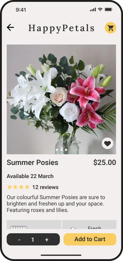
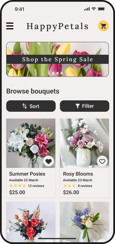
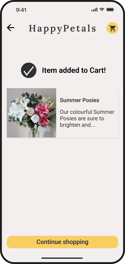
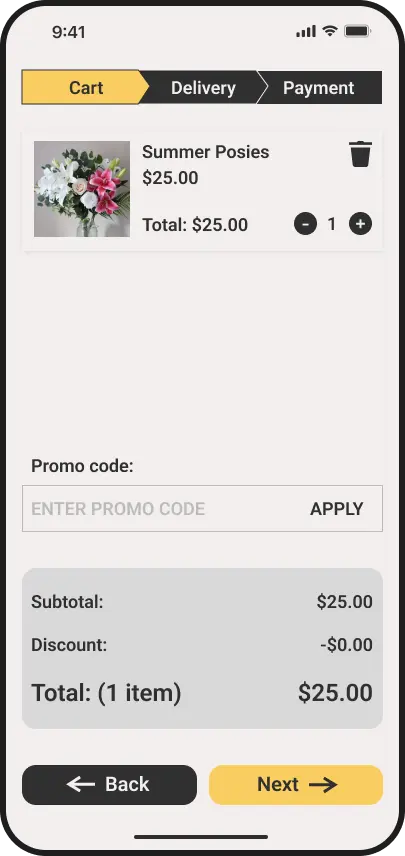
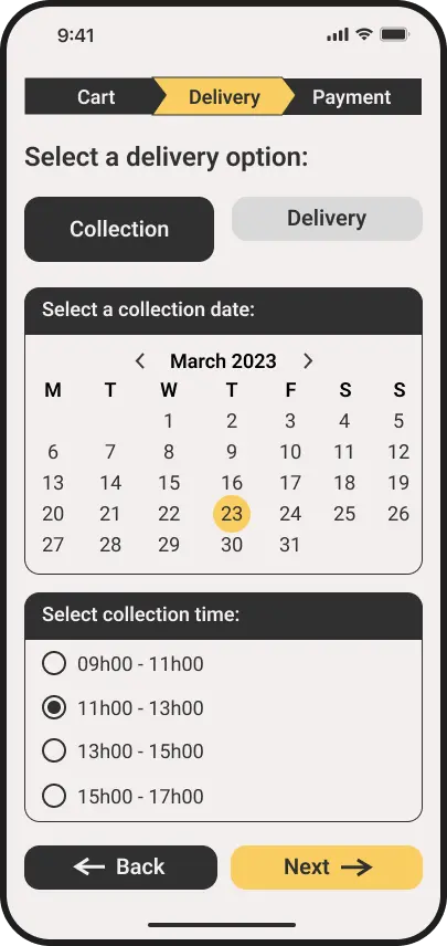
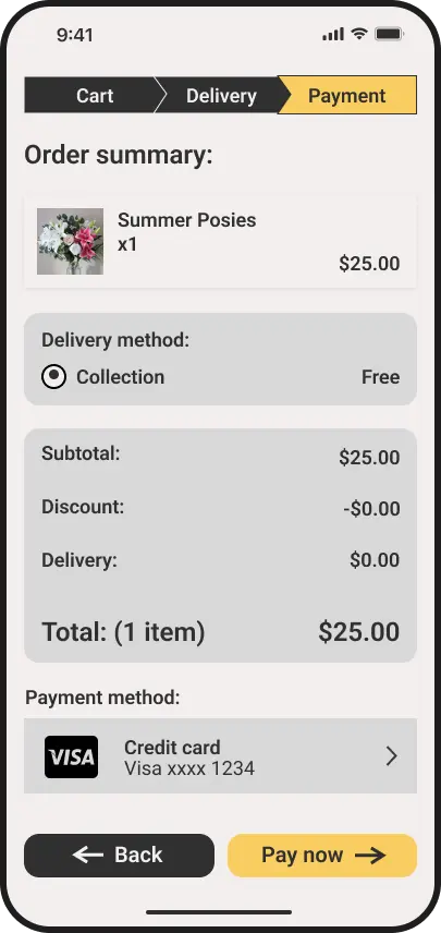
For this project, I used research data to design a new florist app that allows customers to conveniently order floral arrangements. The app offers a streamlined user experience and flexible order collection and delivery options, improving the ordering process for people managing tight schedules.
A selection of mockups of the mobile app.
Process Overview

An iterative process, based on the Design Thinking framework.
I started the process by considering some initial questions, including:
o
How frequently do people purchase flower bouquets?
o
What types of flowers do people usually buy?
o
What difficulties do people experience when purchasing flower bouquets?
To empathize with potential users, I evaluated four sample user bios using my initial questions, carefully considering the perspectives of each user. The primary user group that emerged from the user bios consisted of professionals with schedules too busy and unpredictable to order bouquets in person. I then created a persona and a user journey map to represent this user group's goals and frustrations.
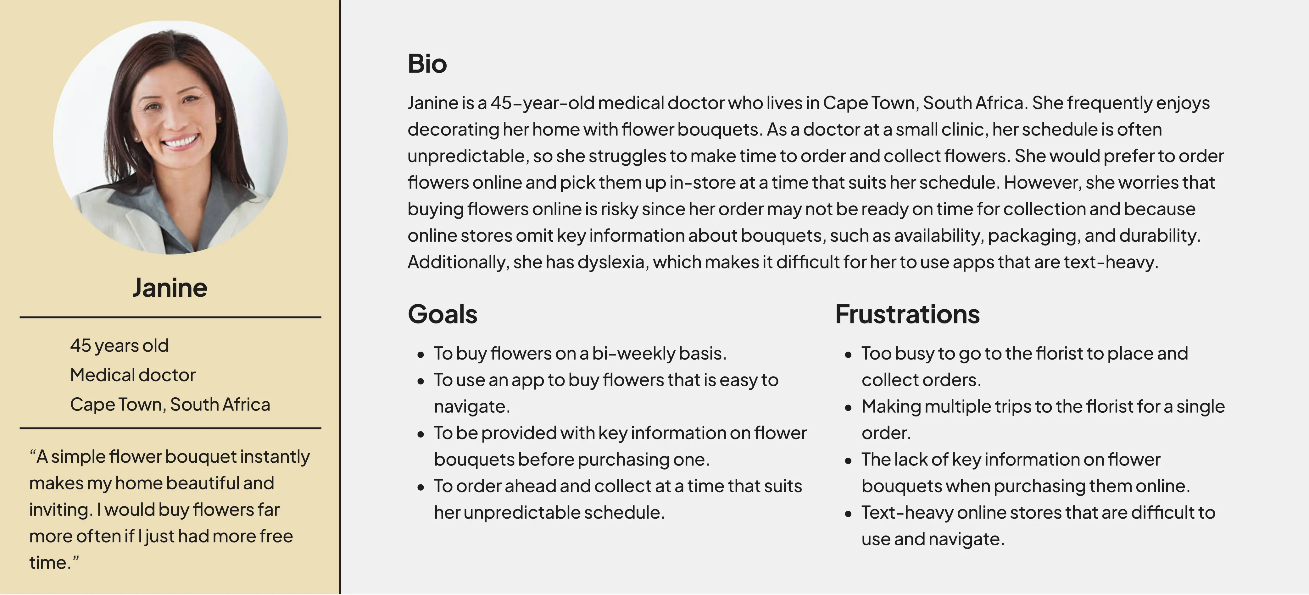
A persona that represents the primary user group.
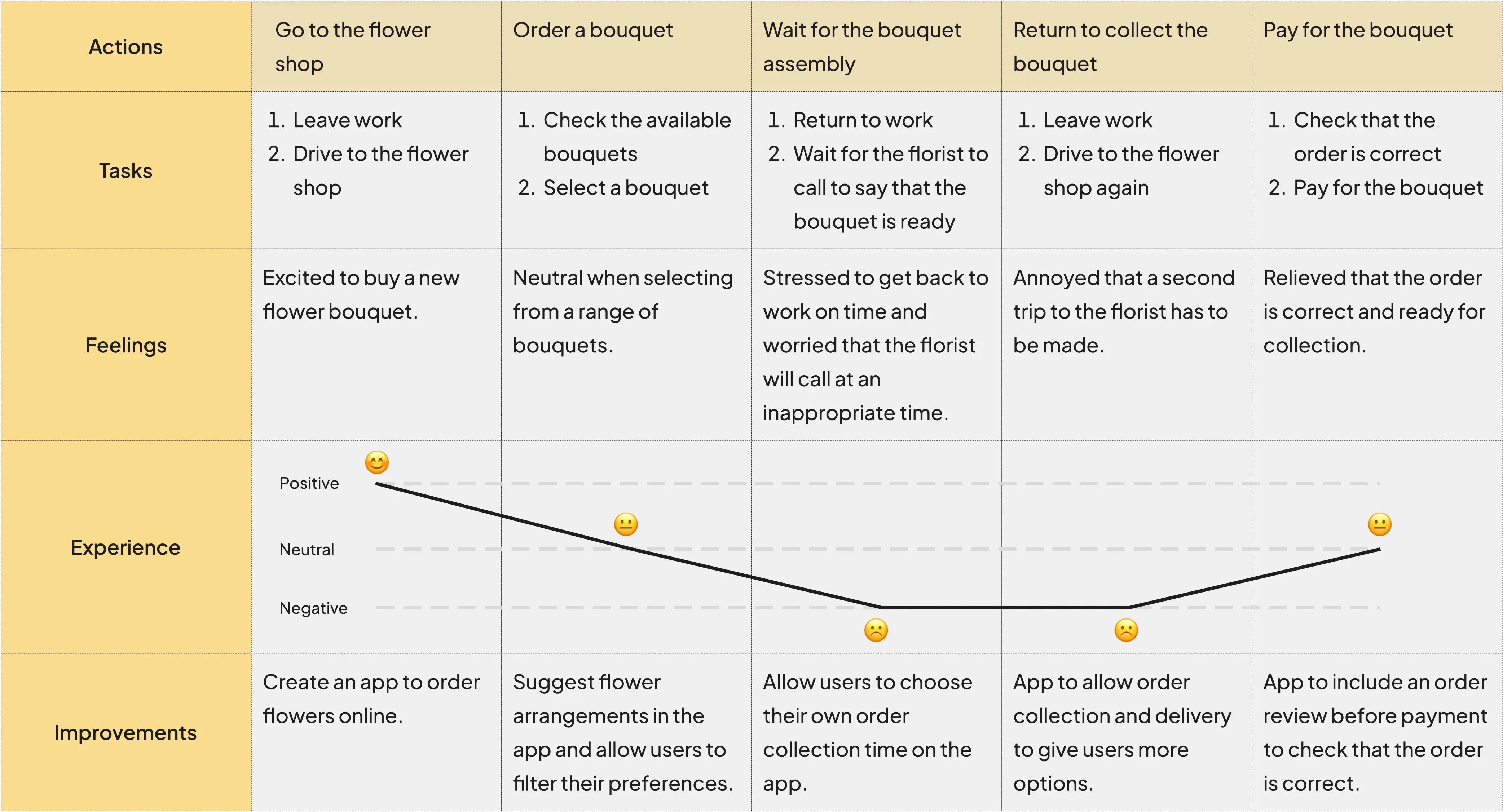
The persona's user journey map.
There are several frustrations that users experience when purchasing bouquets:
o
Users are too busy to make multiple trips to the florist to place and collect orders.
o
Users are annoyed when they arrive at the florist and their order is not ready.
o
Users feel that online stores are not transparent about product availability, pricing, packaging, and durability.
o
Users find it difficult to purchase bouquets on apps that are text-heavy.
Empathizing with users helped define the problem, making it clear that users need an app to browse and order flower bouquets for collection at a specified time. Such an app should be easy to use and navigate, and provide ample information on the florist’s products.
Problem Statement
Janine is a medical doctor who needs a way to quickly order flower bouquets for collection at a time that suits her because her schedule is unpredictable.
Next, I explored similar products offered by competitors to find out what they do well and where there may be gaps. Competitors have elegant branding, matching the tasteful aesthetic of bouquets. They also offer detailed product information and useful features, such as filter/sort options and product reviews. However, the purchasing process on their apps has too many steps and they do not offer the option to collect orders.
Competitors: Bloom & Wild, Little Flora, Moonpig
To generate ideas for the app, I decided to create storyboards that incorporate the competitors’ strengths and the opportunities resulting from the gaps in the market. The storyboards also gave rise to the main user flow.
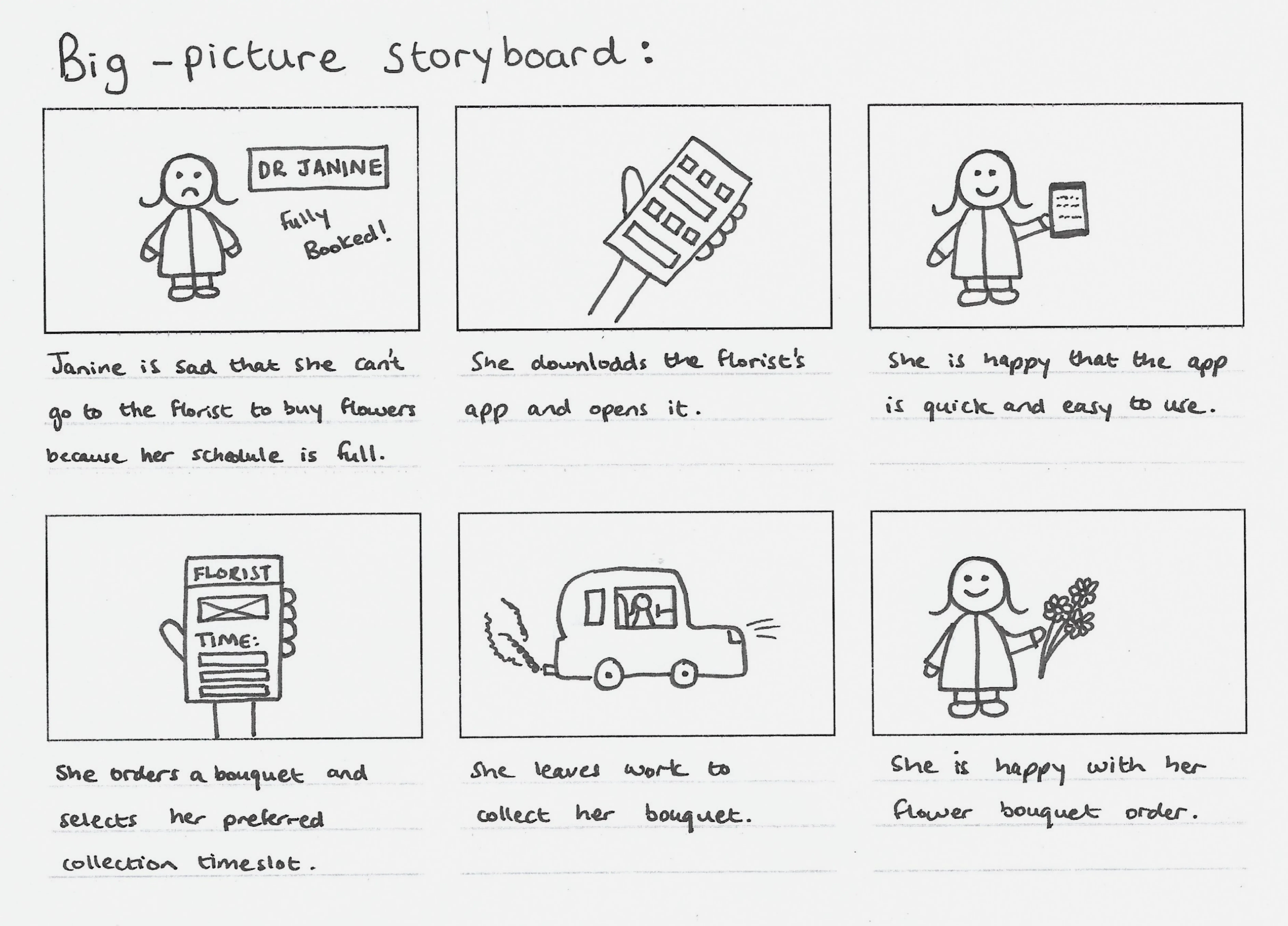
A big-picture storyboard that focuses on the user's needs and the context.
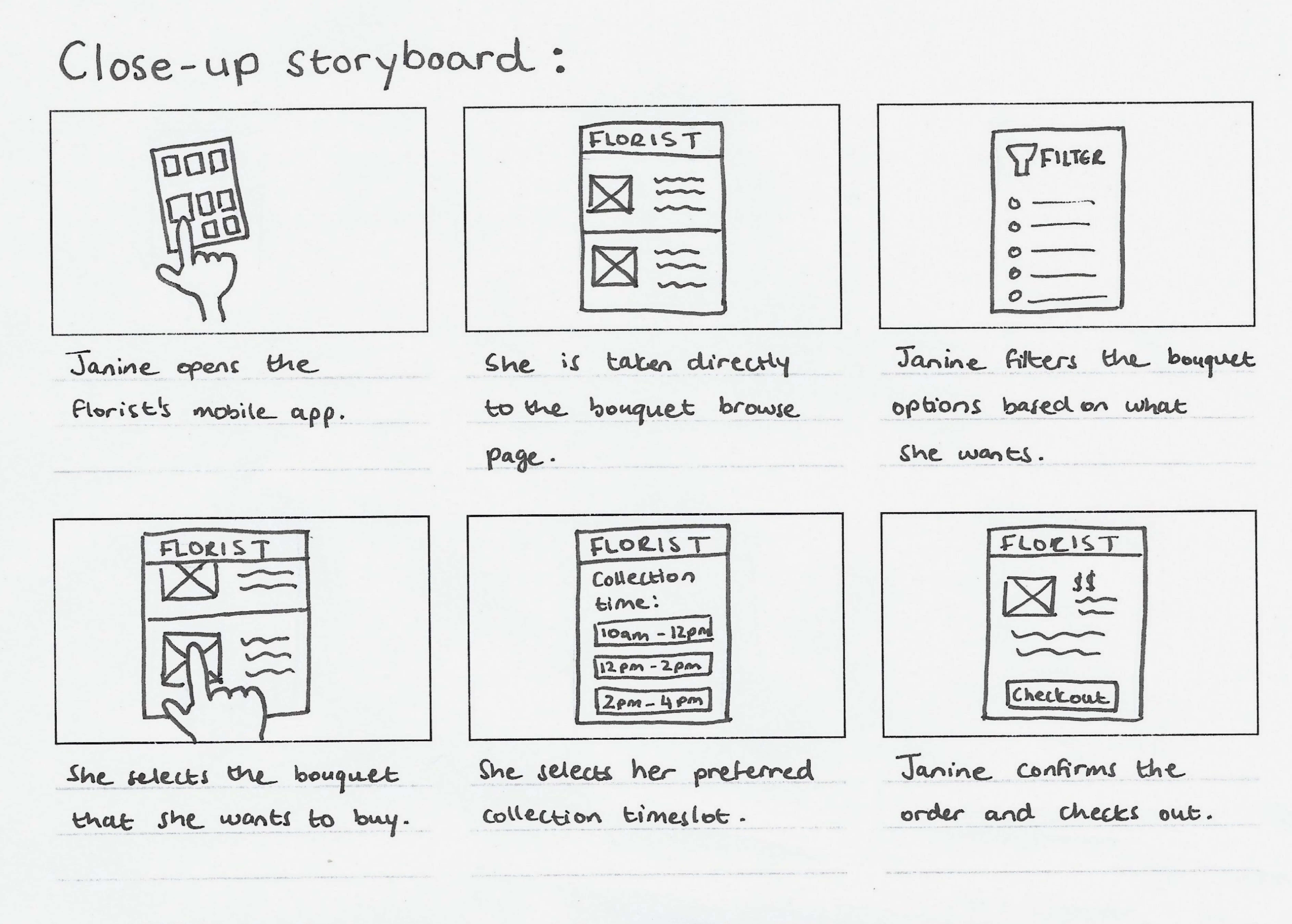
A close-up storyboard that focuses on how the product works.
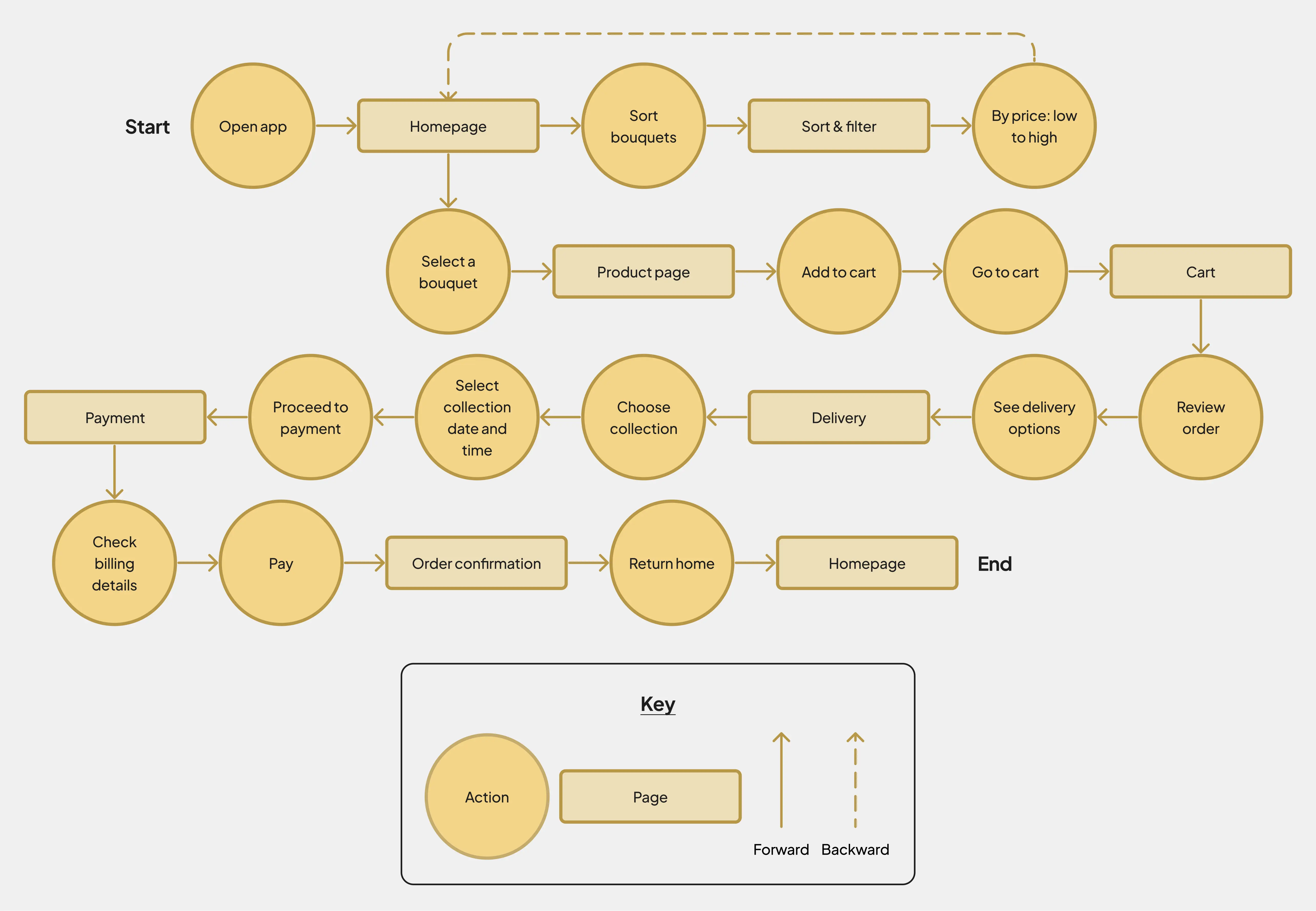
The app's main user flow presented as a flow chart.
I decided to name this app Happy Petals, matching the joyful aesthetic I was aiming for. I then created the first set of wireframes and subsequently conducted a usability study. It revealed the following insights that I used to improve the wireframes:
Insight 1: Label the sort and filter features to help users find them.
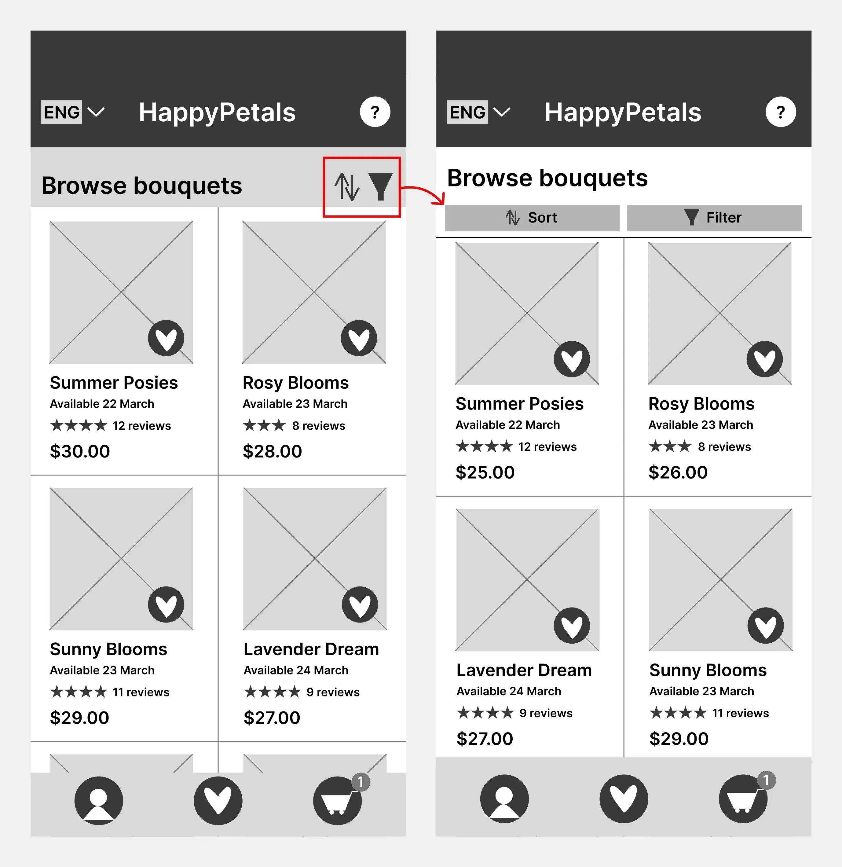
The before and after wireframes of Insight 1.
Insight 2: Make the shopping cart accessible from every page.
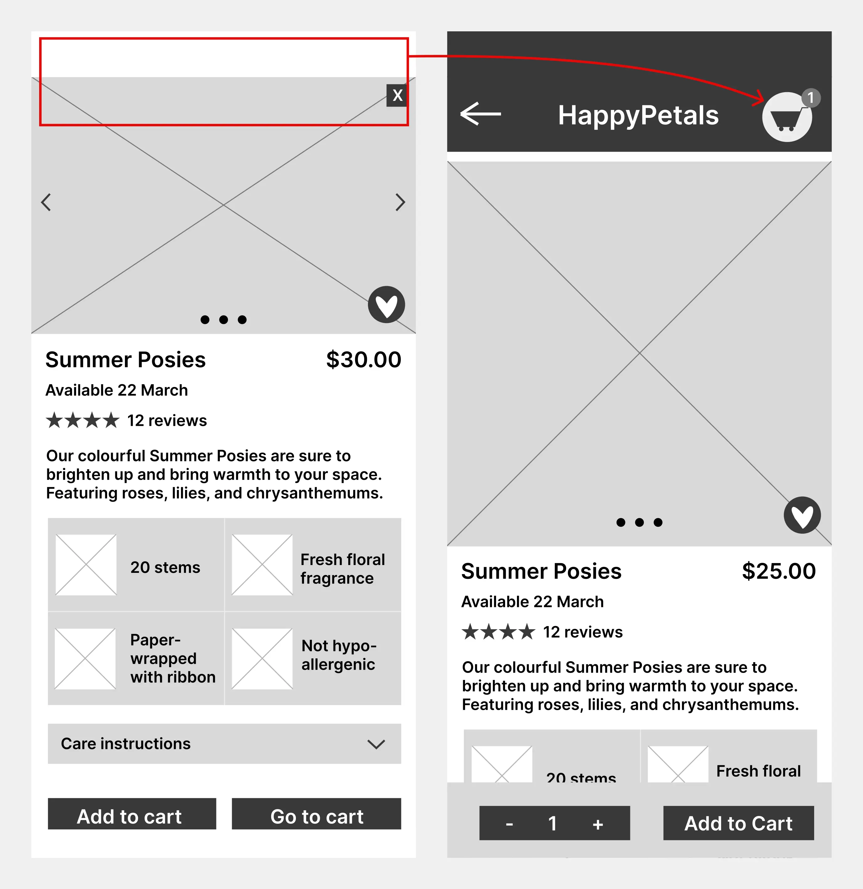
The before and after wireframes of Insight 2.
The colour palette, featuring a yellow accent, was chosen based on colour psychology to give the app a joyful feel. The neutral colours were selected to balance the vibrant yellow, enhancing the elegance of the app. It was important to use the accent colour sparingly to prevent clashes with the colourful product photos.
The colour palette used in the app design.
Next, I created mockups and a high-fidelity (hi-fi) prototype of the app. I then conducted a second usability study to test the prototype, which revealed the following insights that I used to improve the hi-fi design:
1) At the end of the user flow, indicate to the user that checkout is complete.
2) Label all icons to make sure screen readers can be used, making the app more accessible.
Usability Study Metrics
100% Conversion Rate
5/5 participants successfully ordered a flower bouquet for collection at a chosen date and time.
The average time taken for users to complete the main user flow.
Key Challenges
Empathizing with users from sample bios was a challenge since I had to put myself in their position and imagine their perspectives. I find this more demanding than interviewing real participants and analysing their responses because I had to be more mindful to not let my personal biases influence my understanding. Despite this challenge, the project goals were achieved since the app allows users to browse, order, and collect bouquets conveniently.
Next Steps
o
Create a UI kit that includes typography, iconography, buttons, and forms, and use it to improve the consistency of the design.
o
Review the design for compliance with accessibility standards and make the required adjustments.
Lessons Learned
Early testing pays off:
o
Testing lo-fi prototypes catches issues early in the design process and saves time.
o
E.g. After testing the lo-fi design, I made the shopping cart more accessible. However, this improvement may not have been as quick and easy to make after testing the hi-fi design as it is more detailed.
Prioritise high-impact changes:
