Background
In South Africa, we face a problem called “loadshedding”, a term coined for scheduled power outages. I often find myself in the middle of using an electronic device, when, without warning, the power goes out for the entire neighbourhood! Certainly, loadshedding has proven to be extremely disruptive for homes and businesses. Solving South Africa’s power outages seems decades away, so people need to find a way to live somewhat comfortably with loadshedding.
Problem
It is difficult to track when a power outage will happen because the power outage schedules change daily depending on the electricity supply. Existing apps and websites show upcoming power outages a few days in advance but don't provide timely alerts or notifications about schedule changes. This makes it tough to plan daily tasks around the power outages.
Goal
To design an app that sends users timely alerts for upcoming power outages and notifies them of schedule changes at various locations.
My Impact
For this project, I used research data to design a new app that can help users proactively manage loadshedding events by providing timely notifications. This app helps keep users informed about power outages in their areas of interest, thereby minimizing disruption to people's lives.
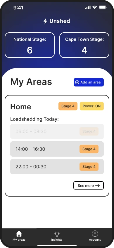
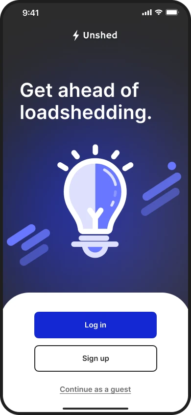
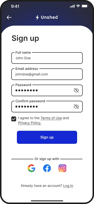
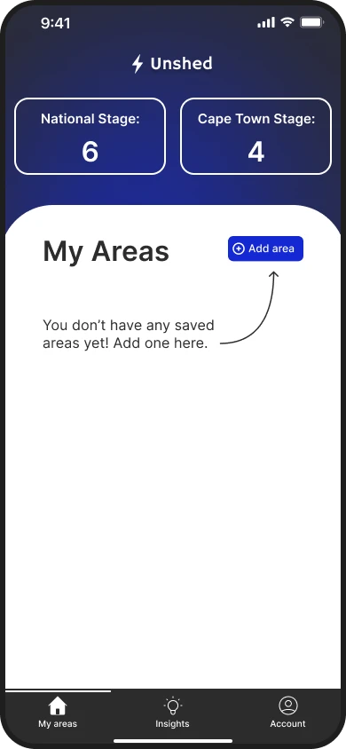
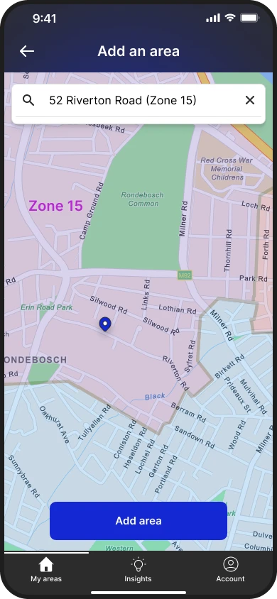
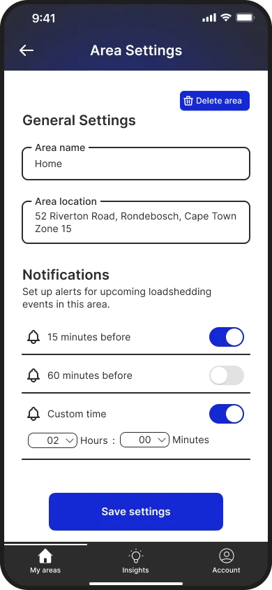
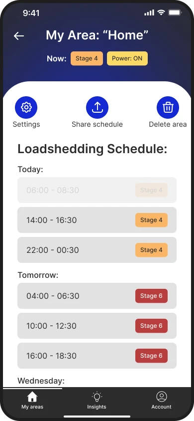
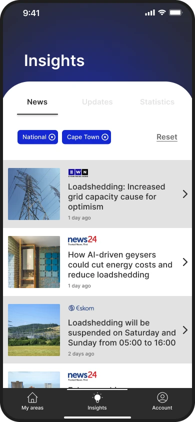
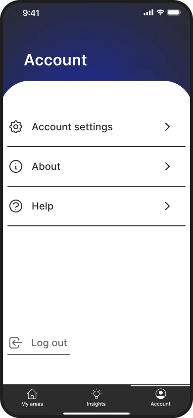
A selection of mockups of the mobile app.
Process Overview

An iterative process, based on the Design Thinking framework.
I brainstormed questions about the impact of loadshedding on people’s lives. How do people prepare for power outages? What resources do they use? How far in advance do they need to know about an upcoming outage? I conducted interviews with five participants to answer my initial questions.
— Participant 1
— Participant 2
— Participant 3
The most significant problem that users experience is sudden power outages, which disrupt daily activities. There seems to be a lack of informative resources to notify users of upcoming power outages and changes to loadshedding schedules. With this in mind, I created a persona that represented the research participants. This helped me empathize with the target user in the remaining design process steps. I also developed the persona’s user journey map, capturing their frustrations and identifying improvement opportunities to create an obstacle-free path for users.
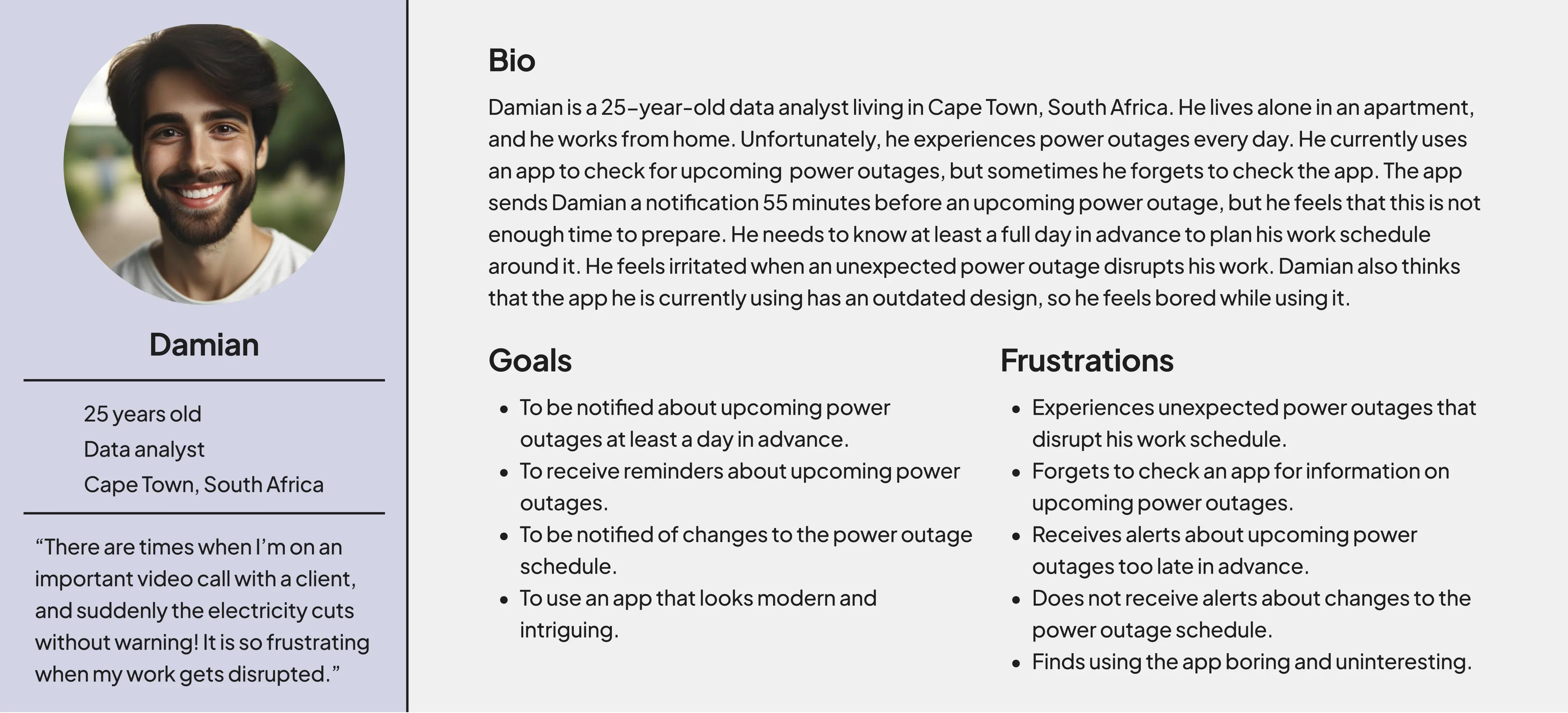
A persona that represents the views of the research participants.
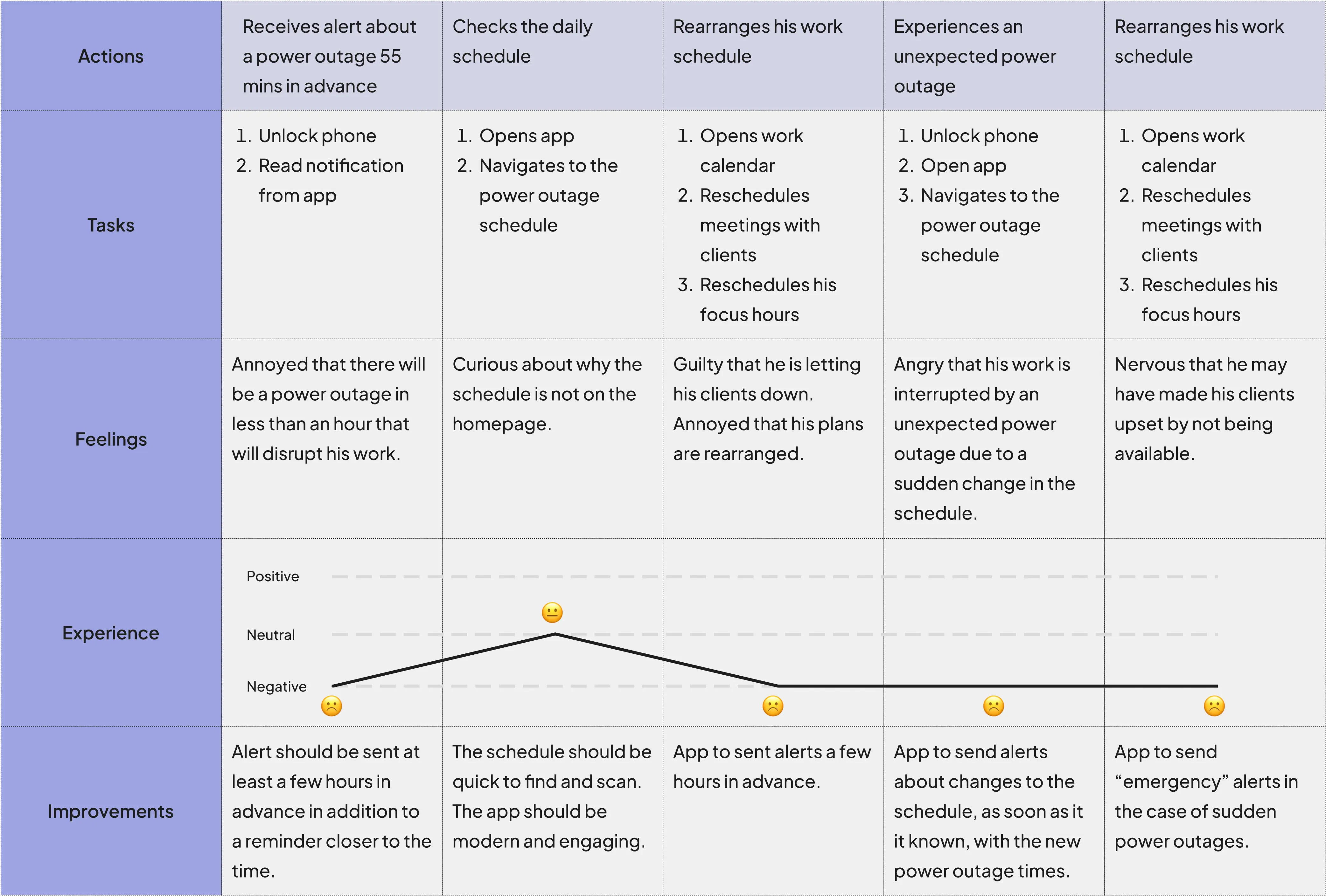
The persona's user journey map.
Having empathized with the user, the problem became clearly defined. It was apparent that the lack of notifications on upcoming power outages and changes to the schedule were major pain points that needed to be addressed in the design.
Problem Statement
Damian is a remote worker who needs timely notifications of upcoming power outages and changes to the loadshedding schedule because his work schedule must be planned around it.
Next, I wanted to explore similar products offered by competitors to examine what works well and where there are gaps. Competitors offer useful features, such as alerts, insights, news, and predicted power outage schedules. However, they don’t allow the customisation of alerts. They also don't provide a good balance of information, resulting in either excessive or insufficient content for the user. Additionally, competitors don't let users input an address to locate a loadshedding zone and its power outage schedule, instead requiring users to know their zone number in advance.
Competitors: Eskom Se Push, Load Shedding Notifier, WhatsUp Eskom
I used the competitors' strengths and opportunities to decide what actions and features were necessary for the app, and then I designed the information architecture around these conclusions. I aimed for intuitive navigation through the main user flow, which involves adding loadshedding schedules for various locations and creating custom alerts.
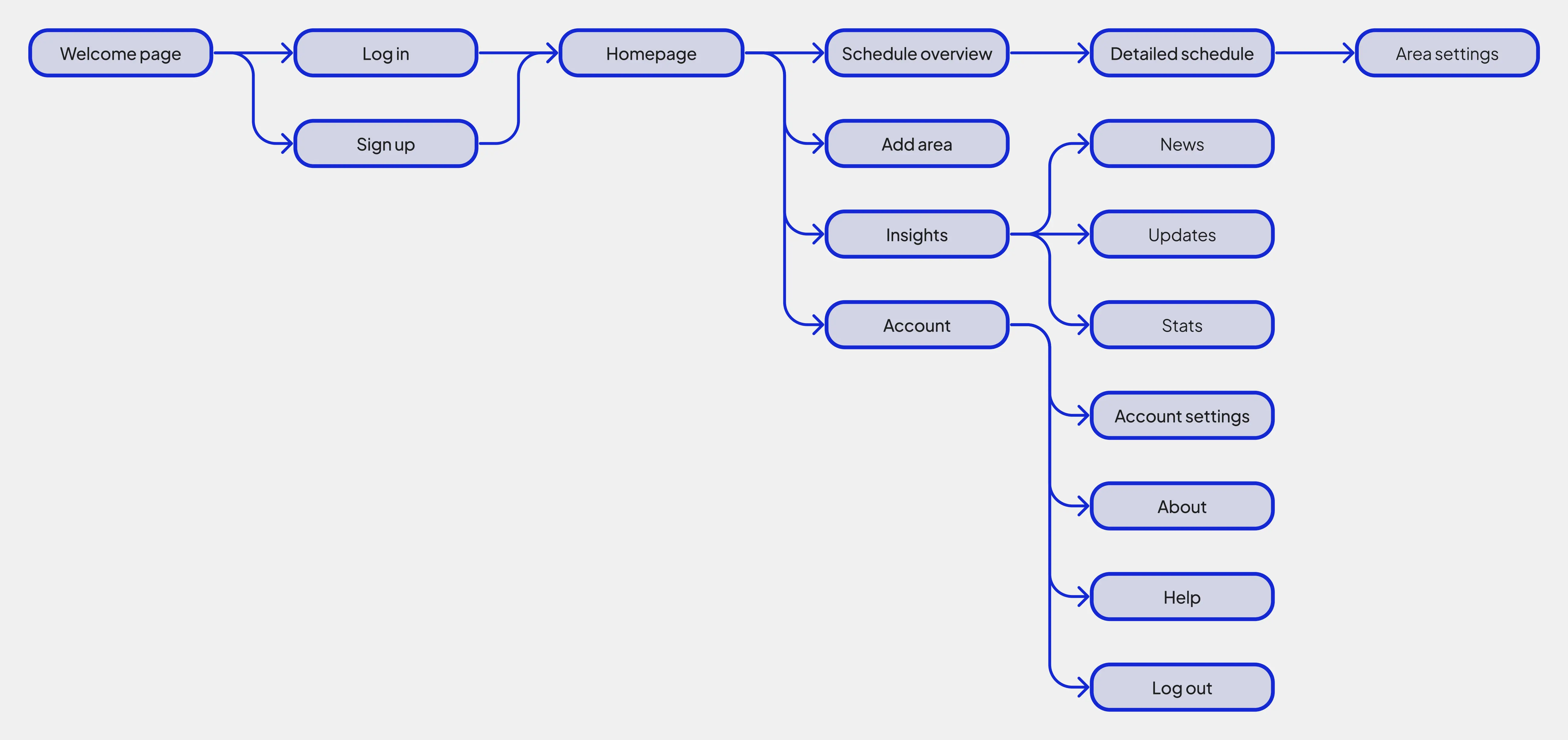
A sitemap showing the hierarchy of pages in the app.
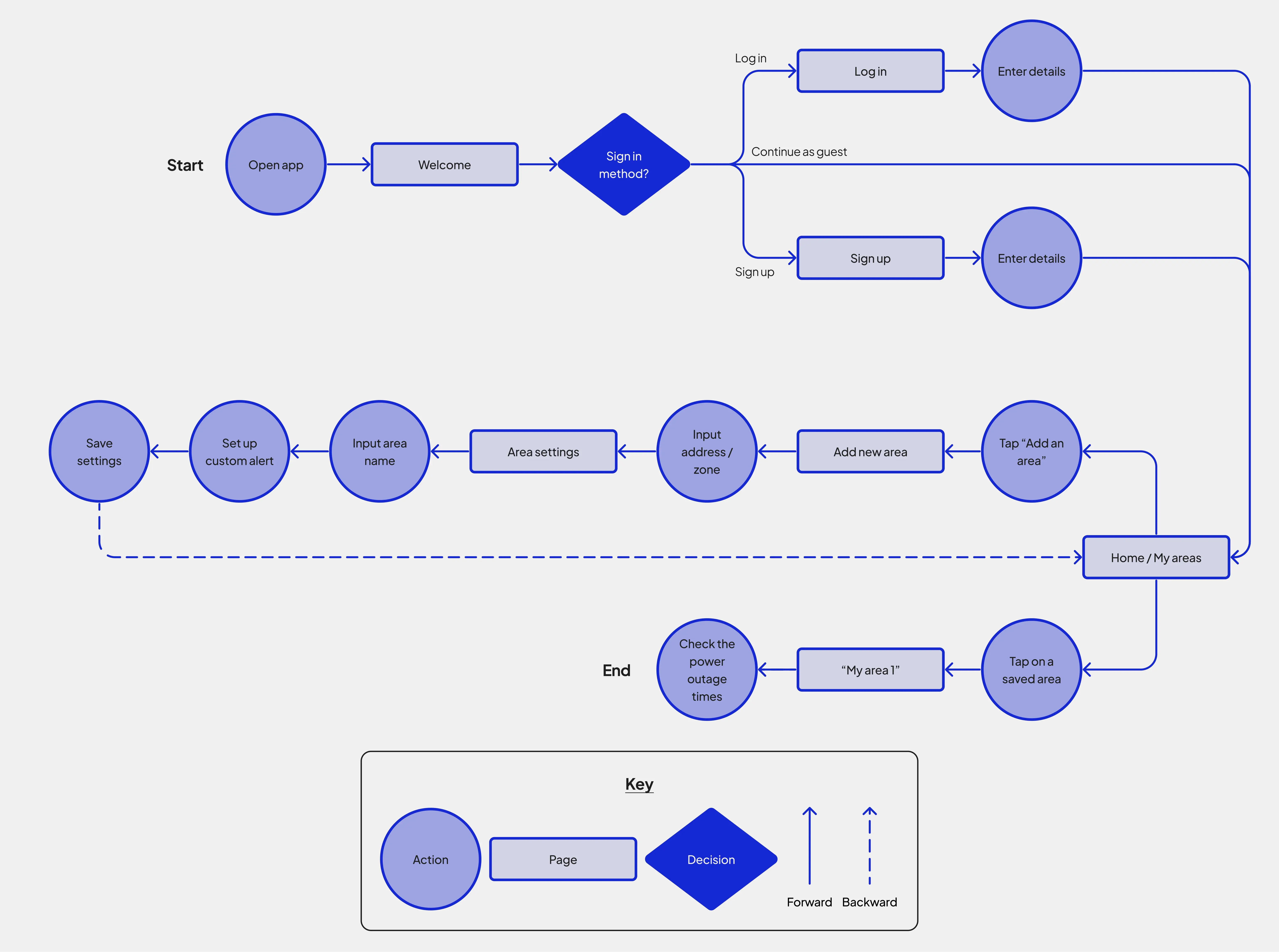
The app's main user flow presented as a flow chart.
After defining the main user flow, I first created wireframes in paper format and then in digital format. The digital wireframes were developed into a low-fidelity (lo-fi) prototype. The lo-fi prototype addressed the defined problem by allowing users to save multiple loadshedding schedules depending on location/zone and set up custom alerts for each area.
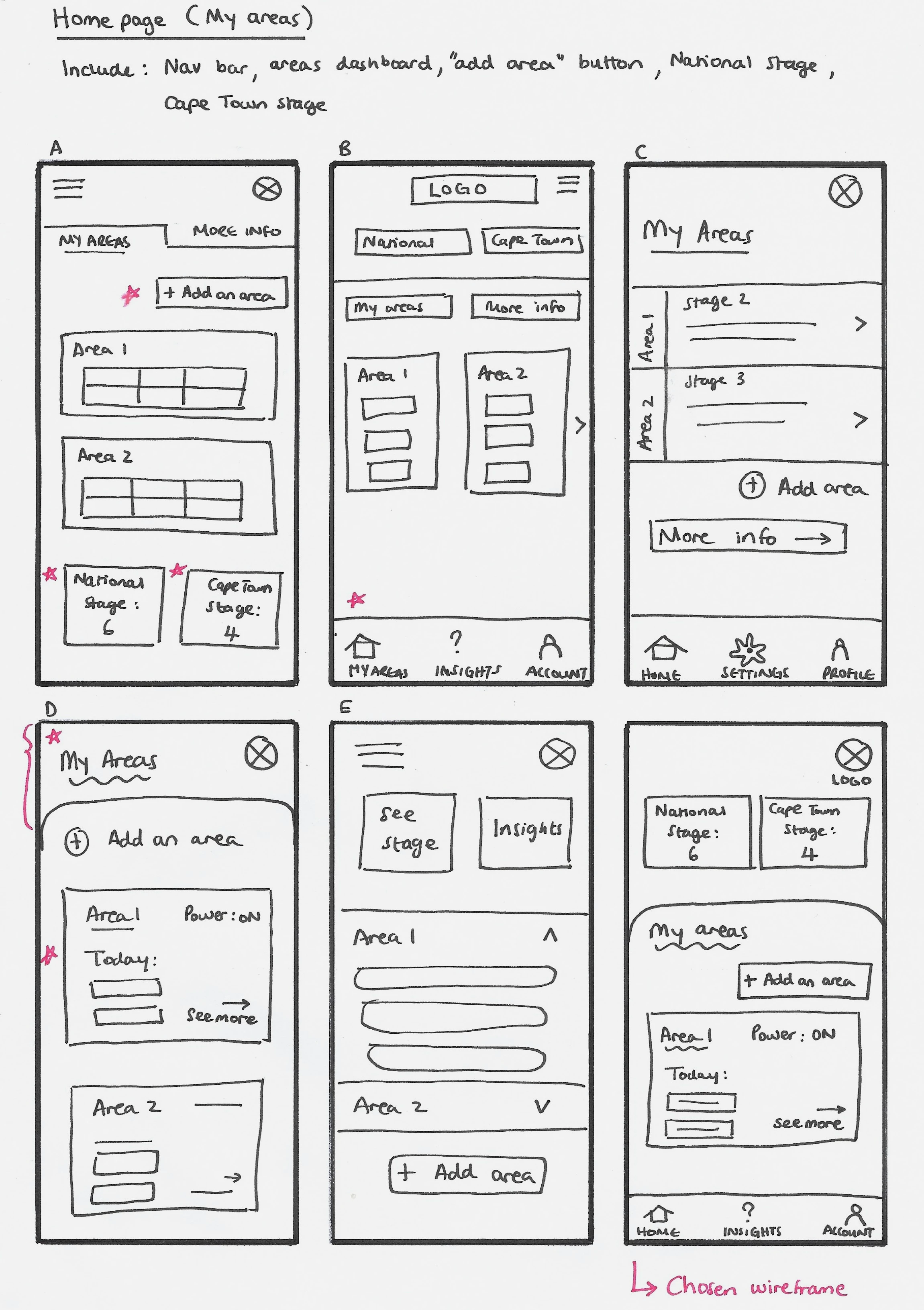
An example of the iterative process used to develop paper wireframes for each page of the app.
The lo-fi prototype was tested in a moderated usability study. The study revealed insights to enhance the app, and I incorporated the most important improvements into the design by updating the wireframes.
Insight 1: Indicate loadshedding zones on the map when adding a new area.
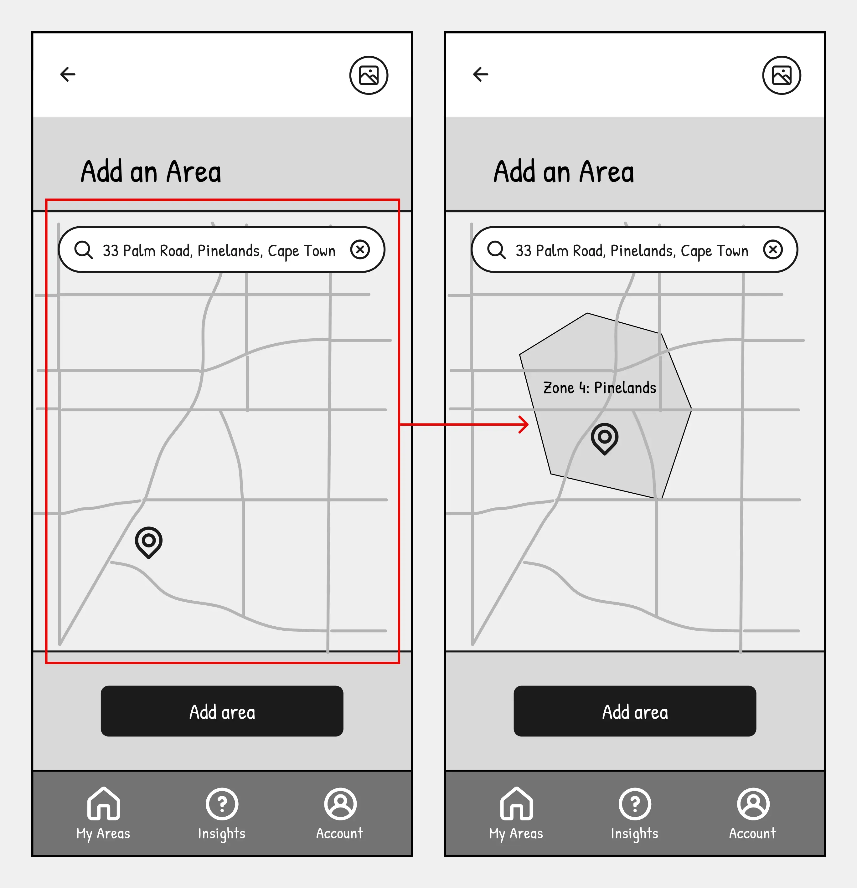
The before and after wireframes of Insight 1.
Insight 2: Simplify settings by removing notification settings from the account page.
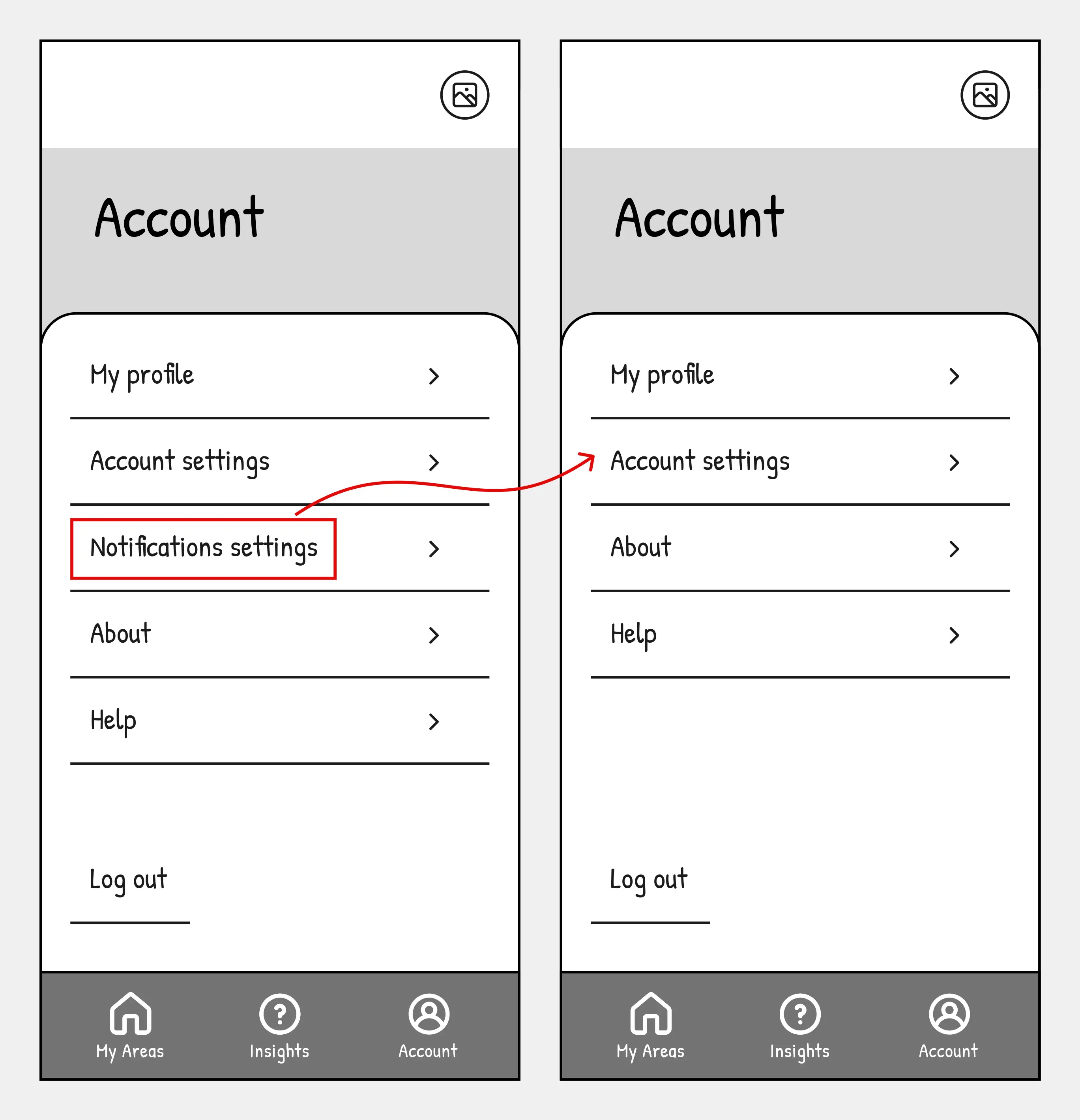
The before and after wireframes of Insight 2.
Usability Study Metrics
100% Conversion Rate
5/5 participants could find, save, and use the loadshedding schedule they required.
The average time taken for users to complete the main user flow.
At the start of the high-fidelity (hi-fi) design, I created the elements in the UI kit. My goal was to give the app a modern and harmonious aesthetic. I established the colour palette and typography, then proceeded to develop the logo, icons, buttons, and forms.
P.S. I named the app “Unshed” to symbolize staying ahead of loadshedding occurrences.
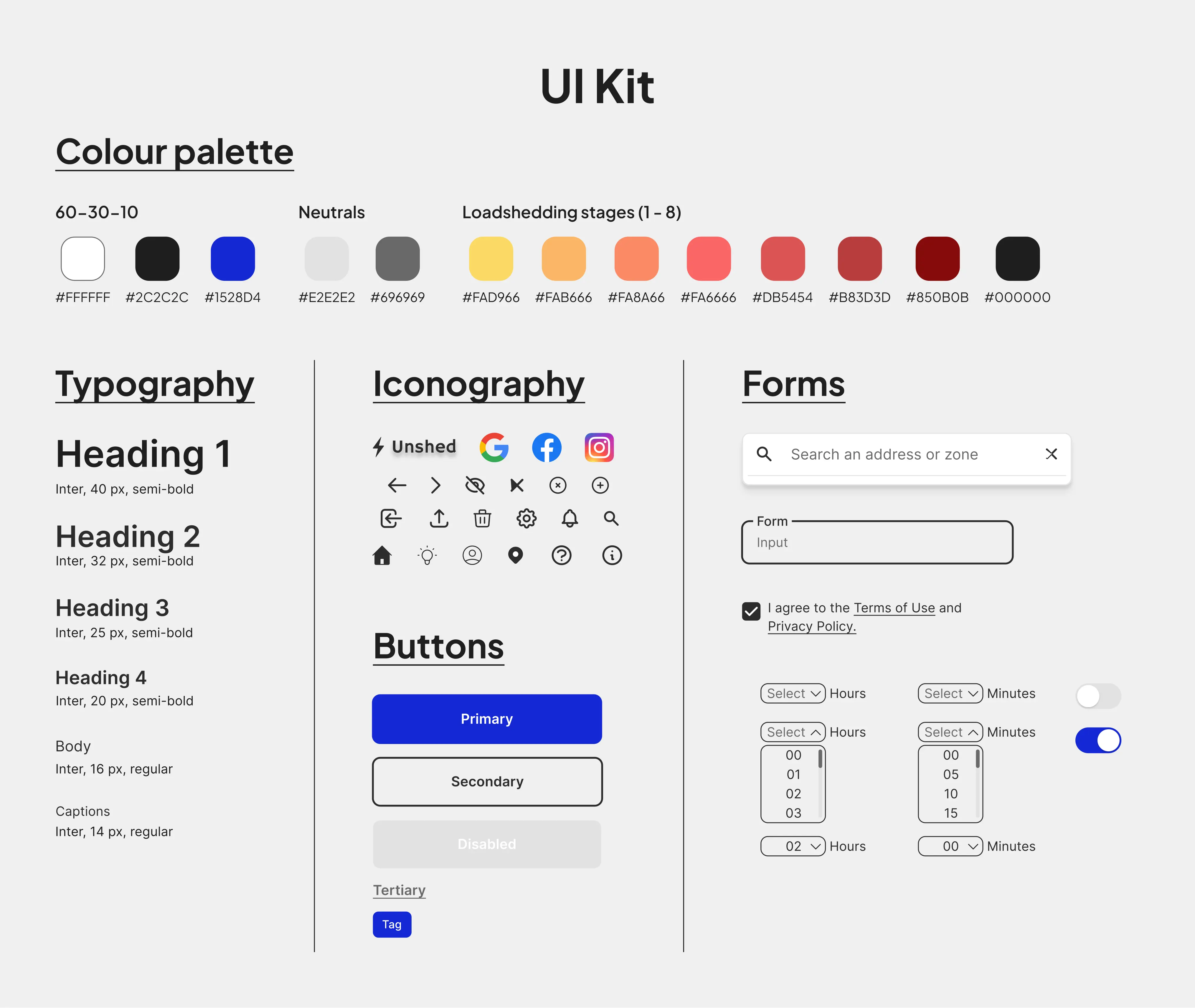
The UI Kit that was used to maintain consistency in the design.
Using the UI kit and the latest iteration of wireframes as a reference, I created mockups that were developed into a hi-fi prototype.
Key Challenges
While empathizing with users and testing the design, I faced challenges interpreting user feedback because of its subjective nature. Balancing diverse opinions and minimizing bias was complex, but synthesizing the feedback and being aware of my own biases helped me push through.
Also, tight project timelines limited design iterations and prevented a second round of testing. Despite this time constraint, I was able to design the core aspects of the app that met the project goal, which was to ensure that users could set up timely alerts for upcoming power outages and schedule changes at different locations.
Next Steps
A second round of testing could be done to validate the changes made to the design based on insights from the first usability study. It would also help refine the design by uncovering any remaining issues.
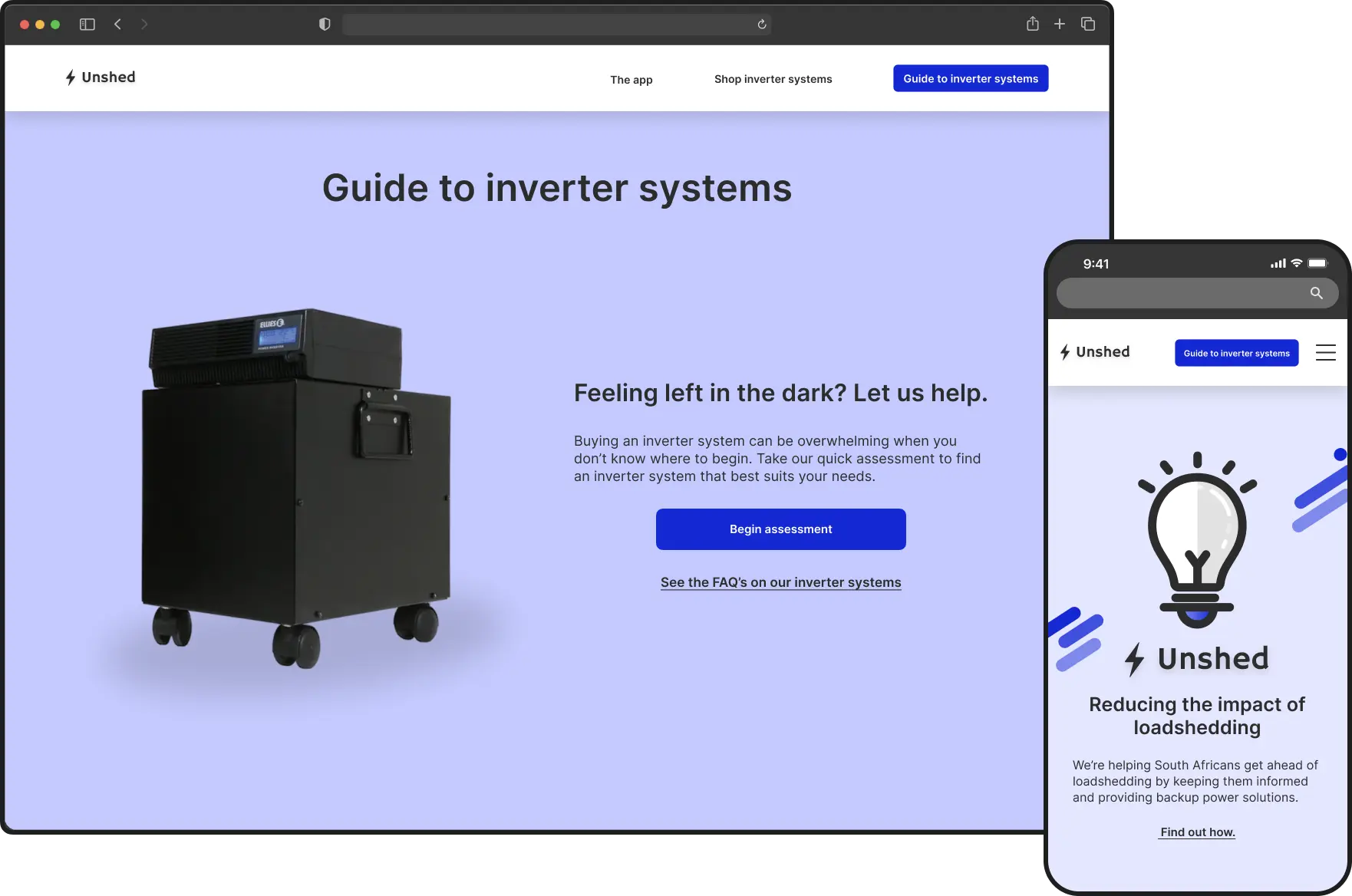
A corresponding website that promotes this app and facilitates the purchase of backup power systems was designed once this project was completed.
Lessons Learned
Simplify and prioritise:
o
Keep the design simple and prioritise key features to avoid overwhelming users.
o
E.g. I replaced large, distracting pop-ups with smaller drop-down boxes to set up customised alerts.
Consistency is key:
