Background
Going to the movies is fun, but buying tickets and snacks can be frustrating when websites are not easy to use or lack options. If websites were more user-friendly, the movie-going experience would be even more enjoyable and stress-free for everyone.
Problem
Buying tickets online can be time-consuming and these websites sometimes lack sufficient information about the movies. Plus, some sites don't allow the online purchase of snacks, leading to waiting in line at the theatre. It would be more convenient if these websites were faster, provided comprehensive movie details, and allowed for the seamless purchase of tickets and snacks.
Goals
To design a website for a movie theatre that streamlines the purchase of tickets and snacks. To set a new standard for user-friendly and efficient movie theatre websites.
My Impact
I designed a new website for a movie theatre that allows users to conveniently book movie tickets and snacks, in a single transaction or separate transactions, depending on what the user needs. Users no longer have to stand in line at the theatre for tickets and snacks, which saves time and reduces stress. The website also provides sufficient information about the movies, allowing users to make informed decisions based on showtimes and plot details, enhancing their overall movie-going experience.
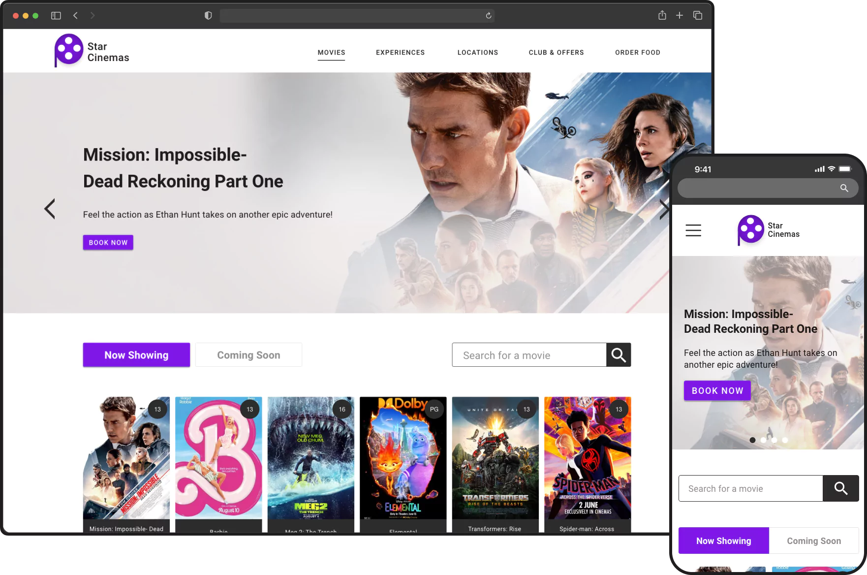
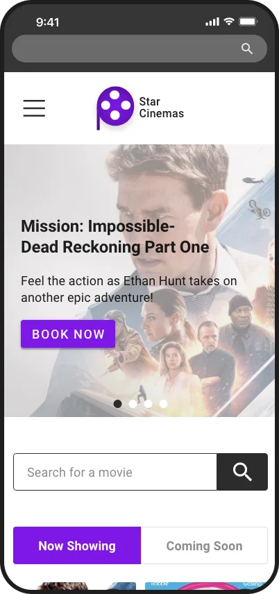
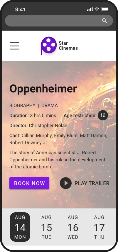
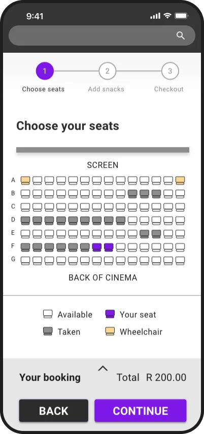
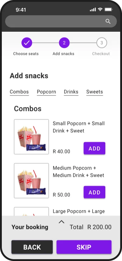
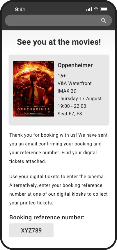
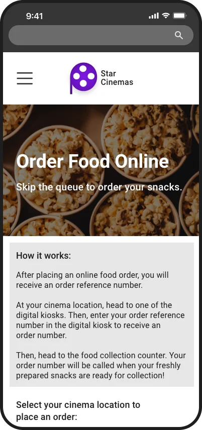
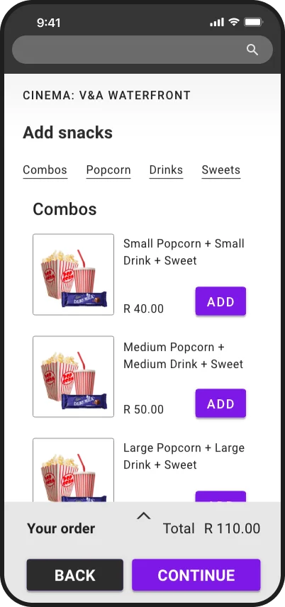
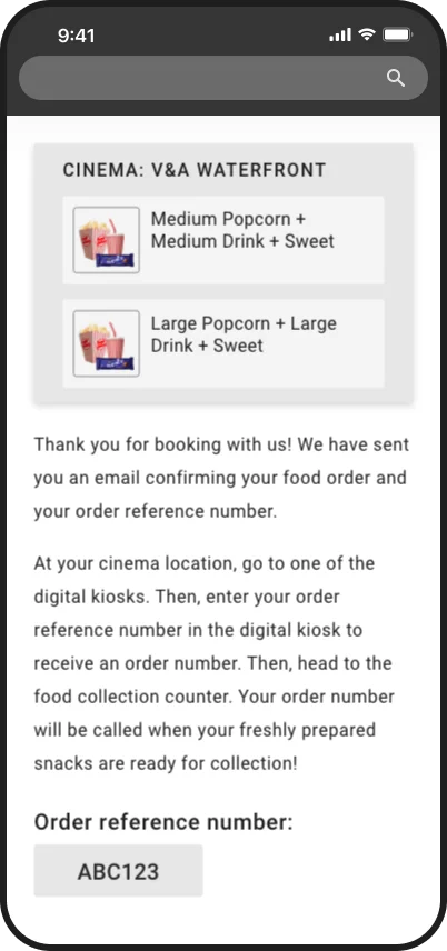
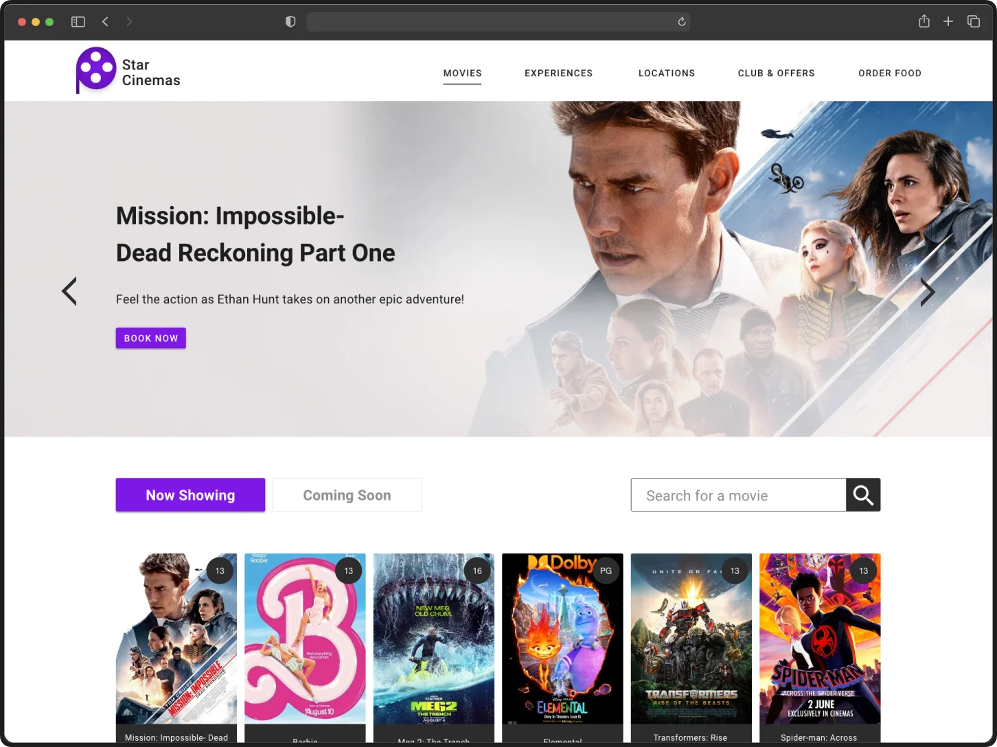
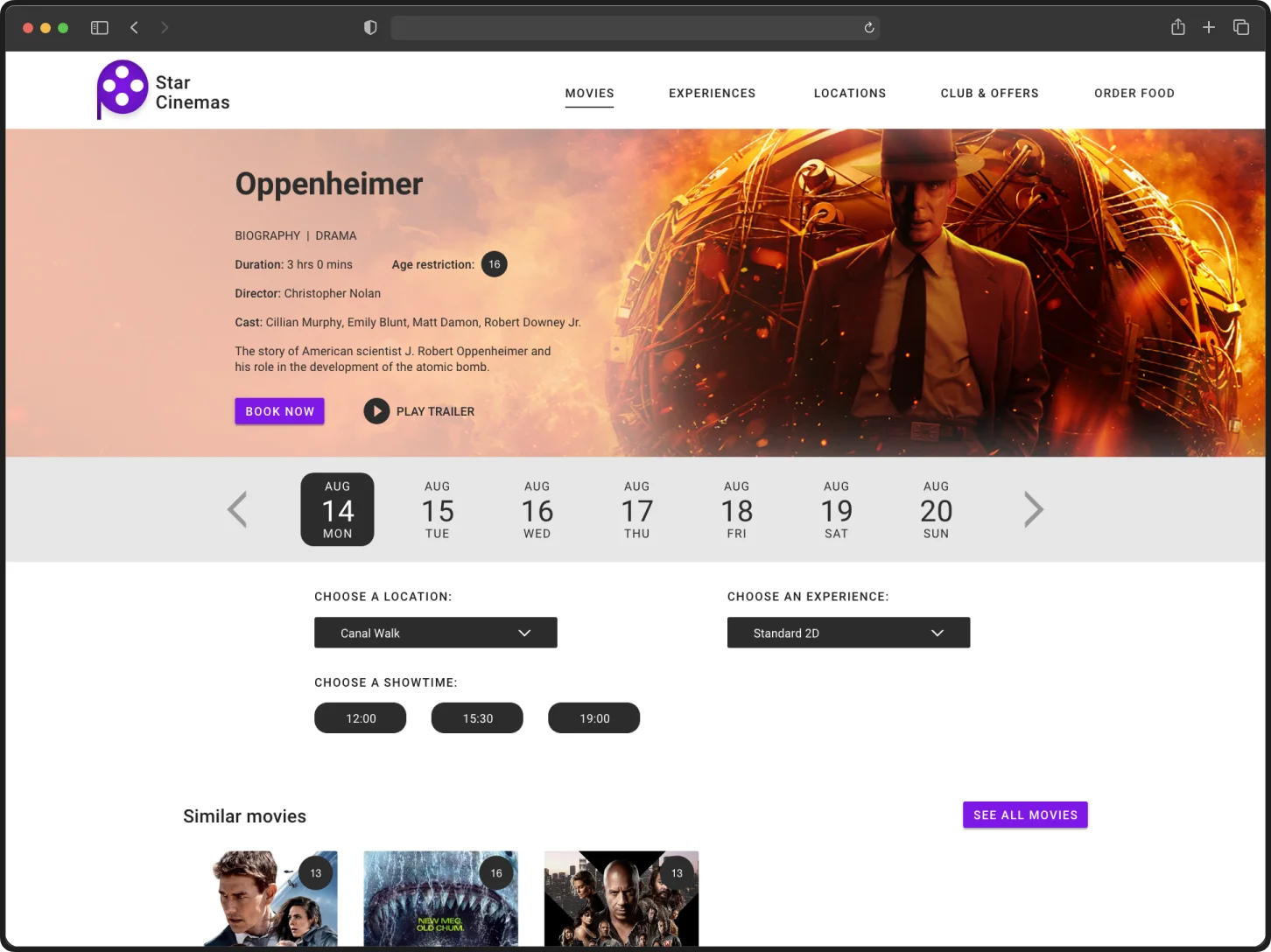
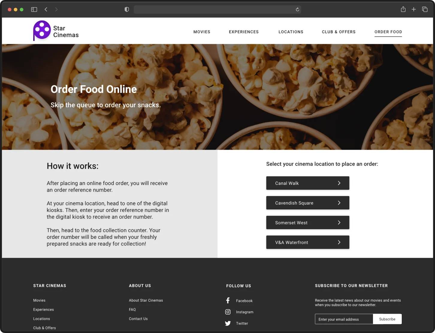
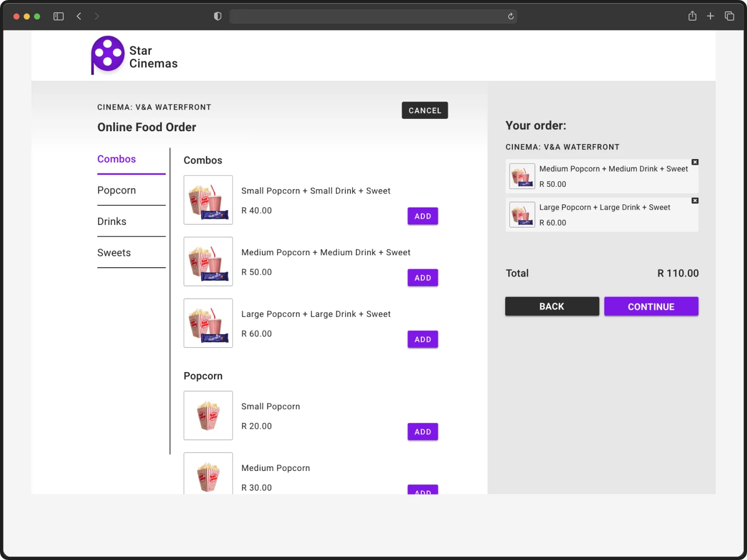
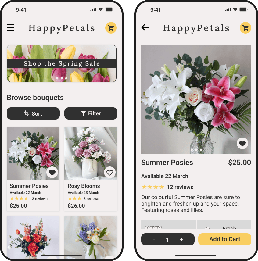
A selection of mockups of the website.
Process Overview

An iterative process, based on the Design Thinking framework.
I wanted to find out what people thought about buying movie tickets and snacks. So, I interviewed five individuals, asking them questions about their past experiences. I explored what they enjoy and dislike about going to the movies, the challenges they encounter when purchasing tickets, and how their experiences differ between online and in-person transactions.
— Participant 1
— Participant 2
— Participant 3
Users feel that waiting in line at the movies to buy tickets and snacks takes too much time. Also, booking online is frustrating because websites can be difficult to use. I created a persona based on the research participants to better understand their goals and frustrations. I also developed the persona’s user journey map, which identified opportunities to remove obstacles for users.

A persona that represents the views of the research participants.
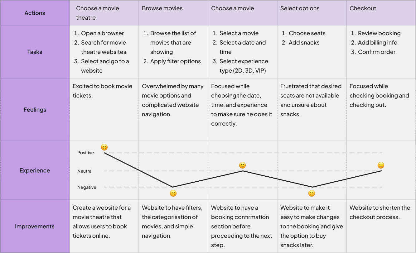
The persona's user journey map.
Understanding user needs and frustrations helped me define the problem in the form of a problem statement:
Problem Statement
Raees is a busy full-time student who needs a way to order movie tickets and snacks online because he does not have time to stand in line at the theatre.
Next, I explored similar products offered by competitors to find out what they do well and where they might need to do better. Competitors provide users with intuitive navigation and offer useful features like filters and search bars. However, they don't allow separate snack orders on their websites, and it's unclear which movies are showing now versus in the future.
Competitors: Ster-Kinekor, Nu Metro, Movies@, Webtickets
To incorporate competitor strengths into the design and solve user frustrations, I considered the following questions, sparking many potential solutions in a Crazy 8s exercise:
o
How might we make the booking process easy to follow?
o
How might we reduce the number of steps users take to order movie tickets?
o
How might we eliminate the need to stand in line to order food at the movie theatre?
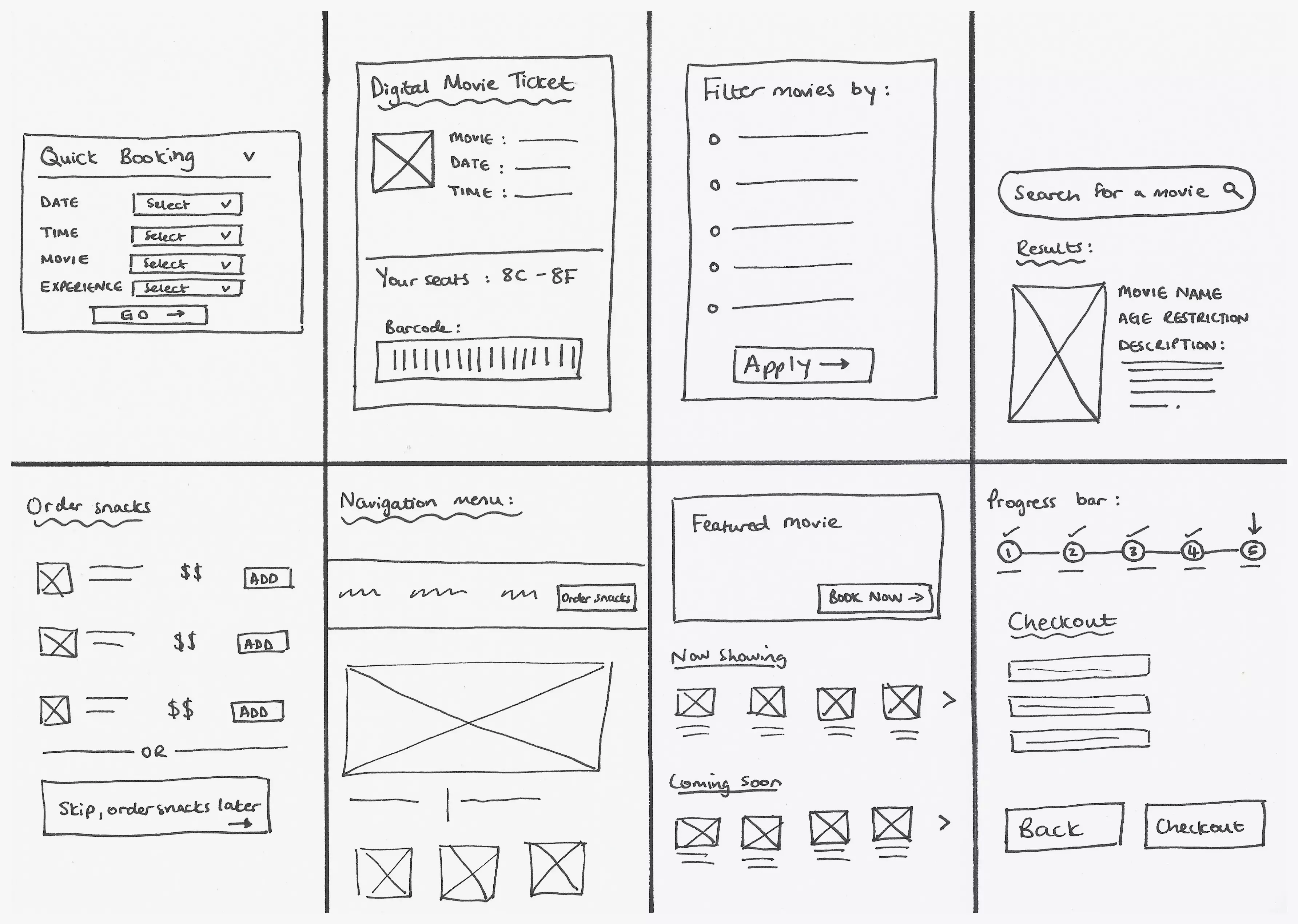
The outcome of the Crazy 8s exercise.
The ideas generated aimed to make the ticket and snack ordering processes quick and easy and eliminate the need to stand in line at the theatre. Keeping these ideas in mind, I saw the need for primary and secondary user flows, which involve booking movie tickets and ordering snacks respectively.
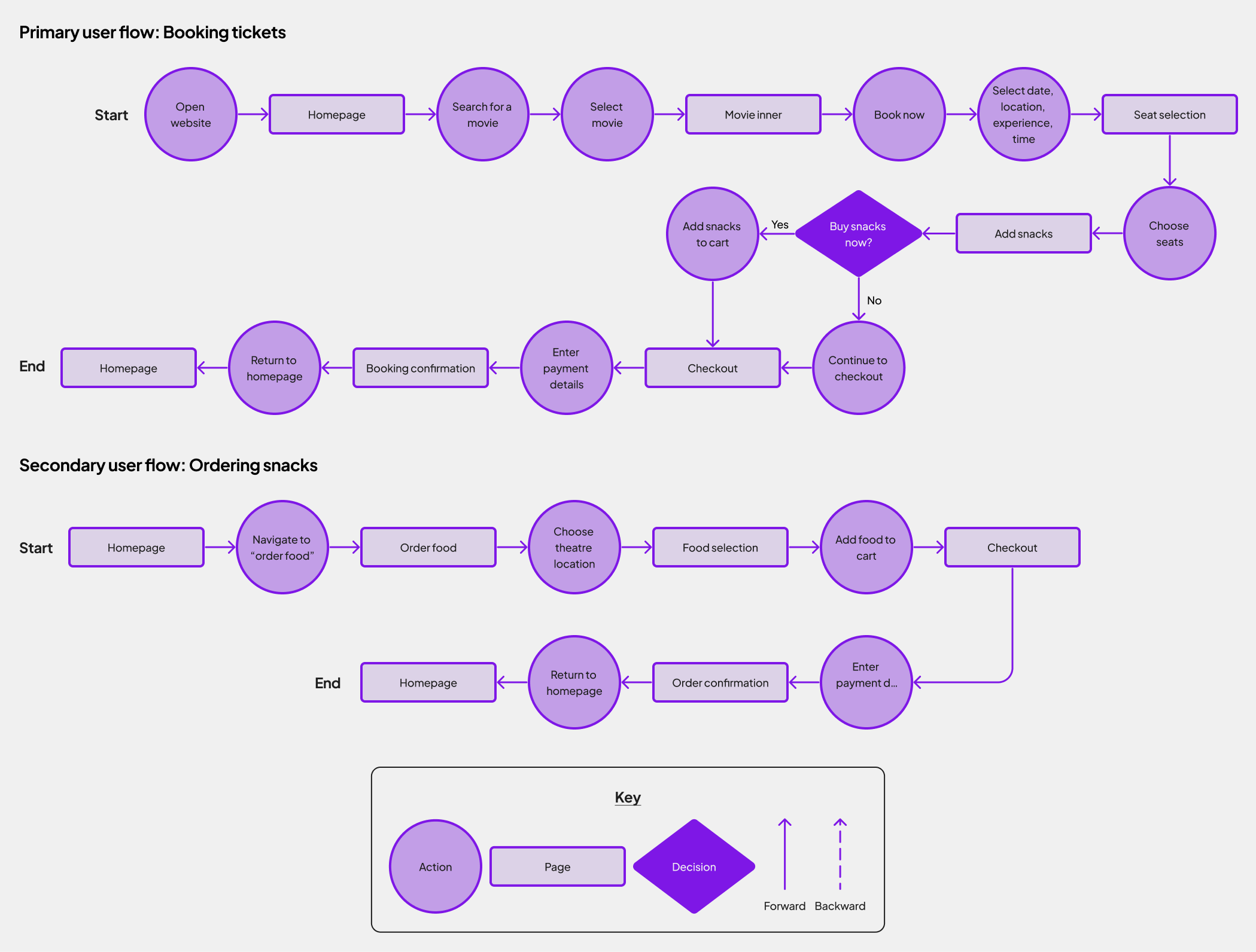
The website's primary and secondary user flows.
I decided to first design the website for large screens and later adapt it to fit mobile devices. This way, I could explore and incorporate many features before adapting them to the limited space on mobile screens. I created the first set of wireframes and a low-fidelity (lo-fi) prototype to run some preliminary testing with users. This allowed me to gather some initial feedback, which guided the rest of the design.
The preliminary testing revealed insights to enhance the website, which I incorporated into the design, including:
1) Keep the search bar but remove the filter feature to not overwhelm the user with too many options.
2) Adjust the fold to show important content without needing to scroll.
3) Resize images and features to fit more aesthetically on the page.
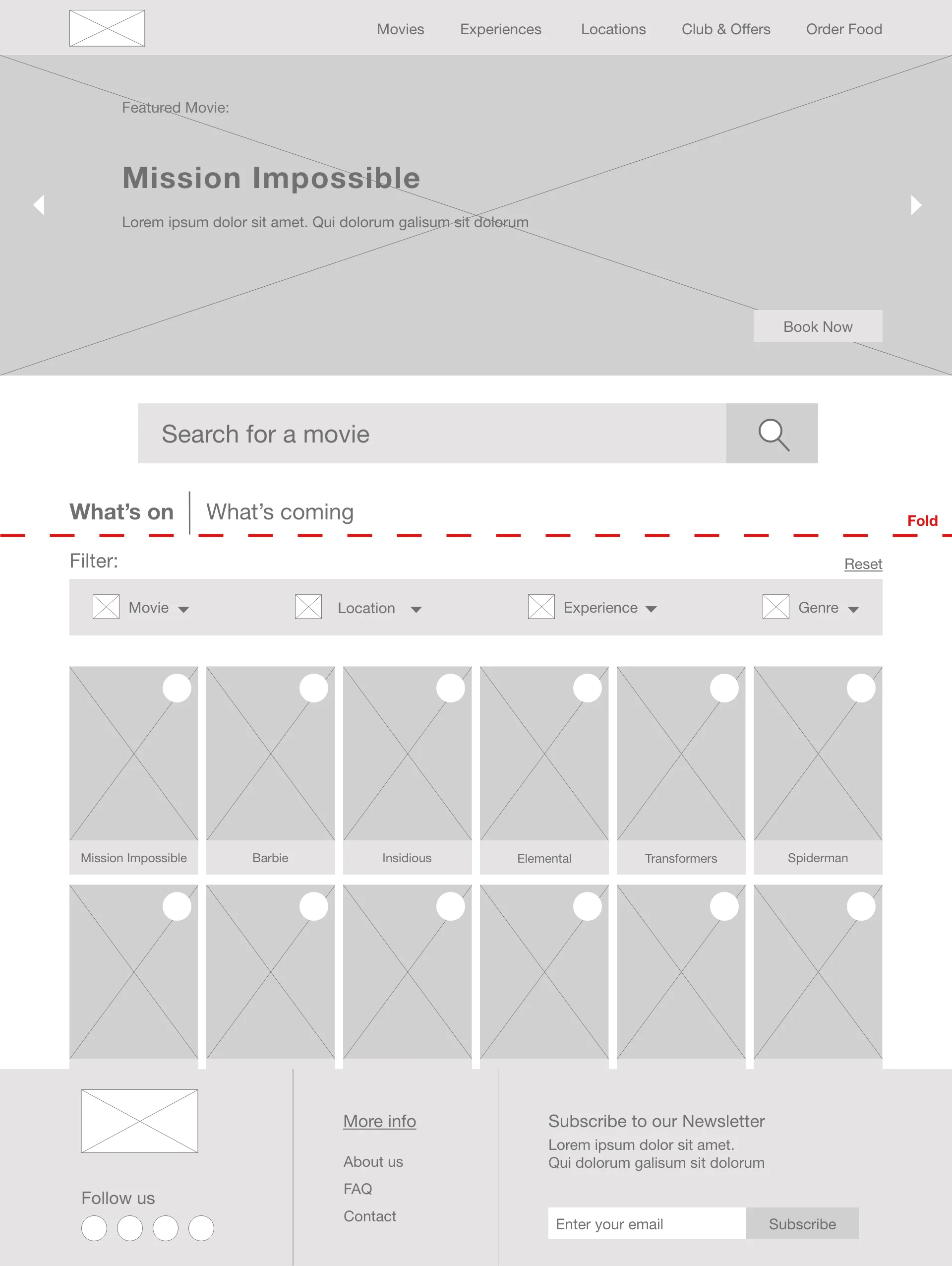
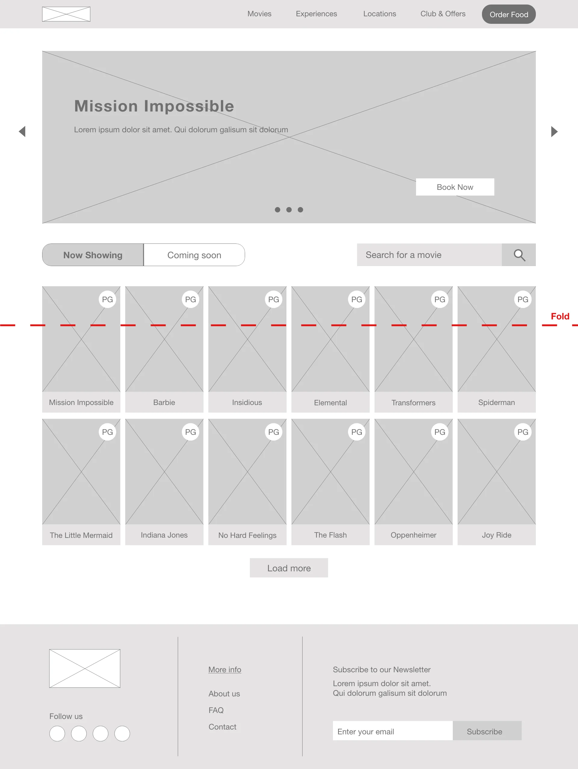
The before and after wireframes of the homepage demonstrating design improvements made.
Usability Study Metrics
100% Conversion Rate
5/5 participants successfully booked movie tickets and placed a separate food order.
The average time taken for users to complete the primary and secondary user flows.
The UI kit was designed to capture the excitement reminiscent of going to the movies. This was done through a modern font, an intriguing colour palette, and complementary elements. From here on, this conceptual movie theatre became known as Star Cinemas.
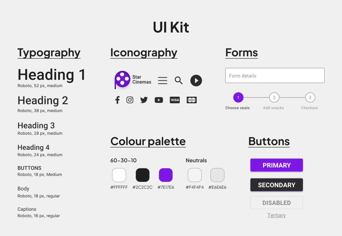
The UI Kit that was used to maintain consistency in the design.
Using the updated wireframes, I created mockups for the desktop website. To show website responsiveness, I also created mockups to fit mobile devices. The mockups were then transformed into high-fidelity (hi-fi) prototypes.
Key Challenges
Websites for movie theatres can sometimes have many features, often overwhelming users with too many options. A key challenge of the project was to determine which features to keep and which to discard. Only the most intuitive and useful features were kept in the hi-fi prototypes.
Another challenge was the time constraints on the project, which prevented a second usability test. Despite these challenges, project goals were met since the website allows users to easily purchase tickets and snacks.
Next Steps
To achieve a fully responsive website, mockups for tablets should also be created at a later stage. Furthermore, a second usability study could be done to check the website's responsiveness across other devices since the first usability study only looked at the desktop website.
Lessons Learned
Content prioritisation:
o
Prioritising content ensures that the core information is communicated clearly.
o
E.g. By placing the most important content above the fold, I helped users complete tasks without needing to scroll.
Responsive navigation:
