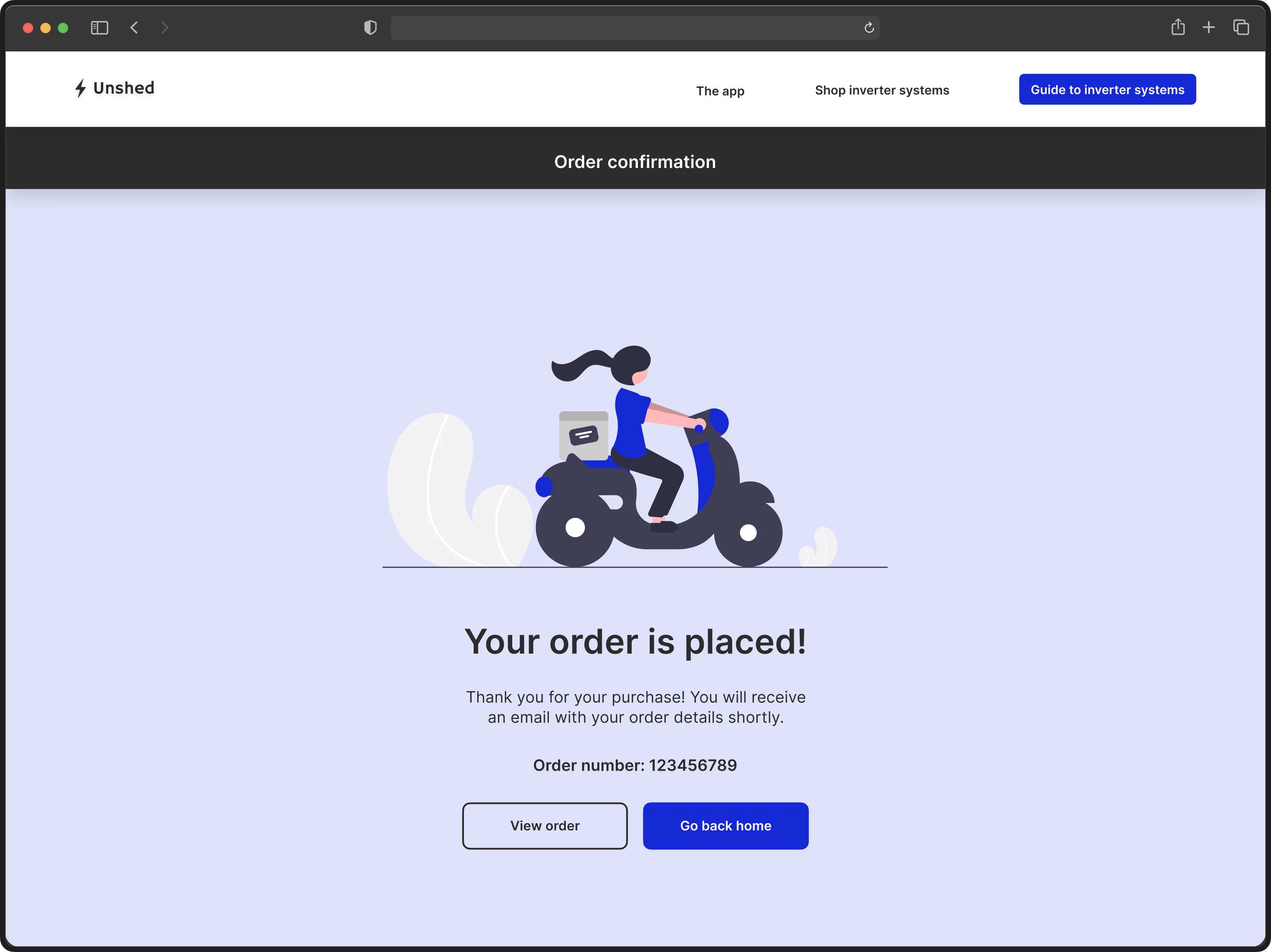
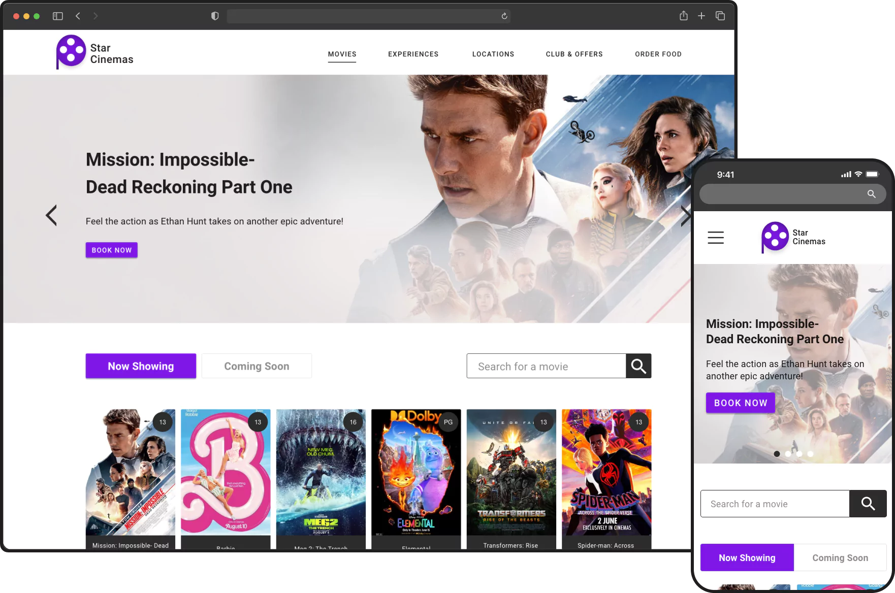
Background
Following the design of the Unshed app, I aimed to further address the ongoing challenge of power outages in South Africa. While the Unshed app is able to notify users about upcoming power outages, the problem of having no access to electricity remains. People still need a practical means to cope with power disruptions. Inverter systems are commonly used backup power solutions in South Africa. They store electricity and deliver it smoothly during power outages. Unlike generators, they are quieter and more fuel-efficient, which is ideal for homes and small businesses.
Problem
Purchasing an inverter system can be a daunting task due to many different models, battery capacities, features, and initial costs. It can be difficult for individuals to choose the right one for their needs.
Goal
To design a responsive website that facilitates the purchase of inverter systems that meet individual needs.
My Impact
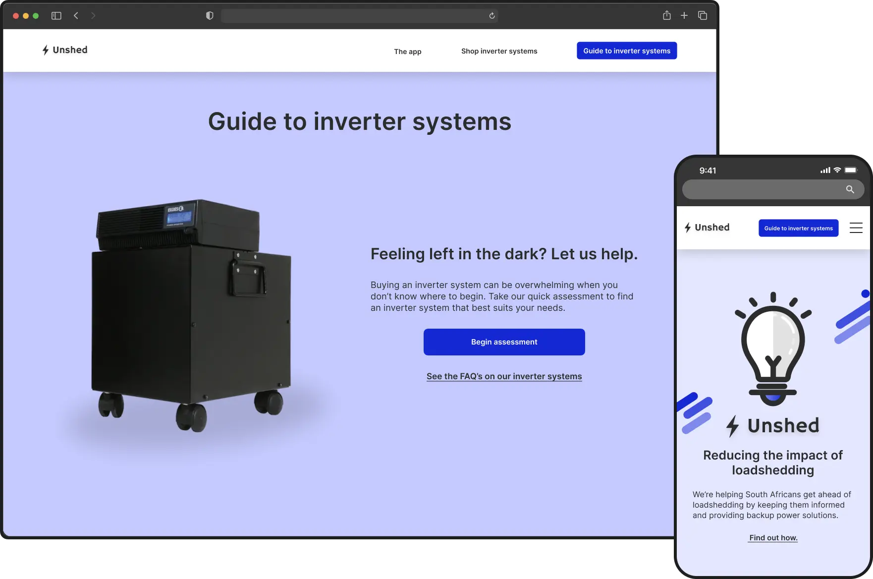
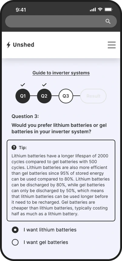
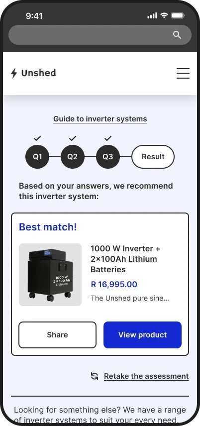
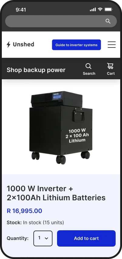
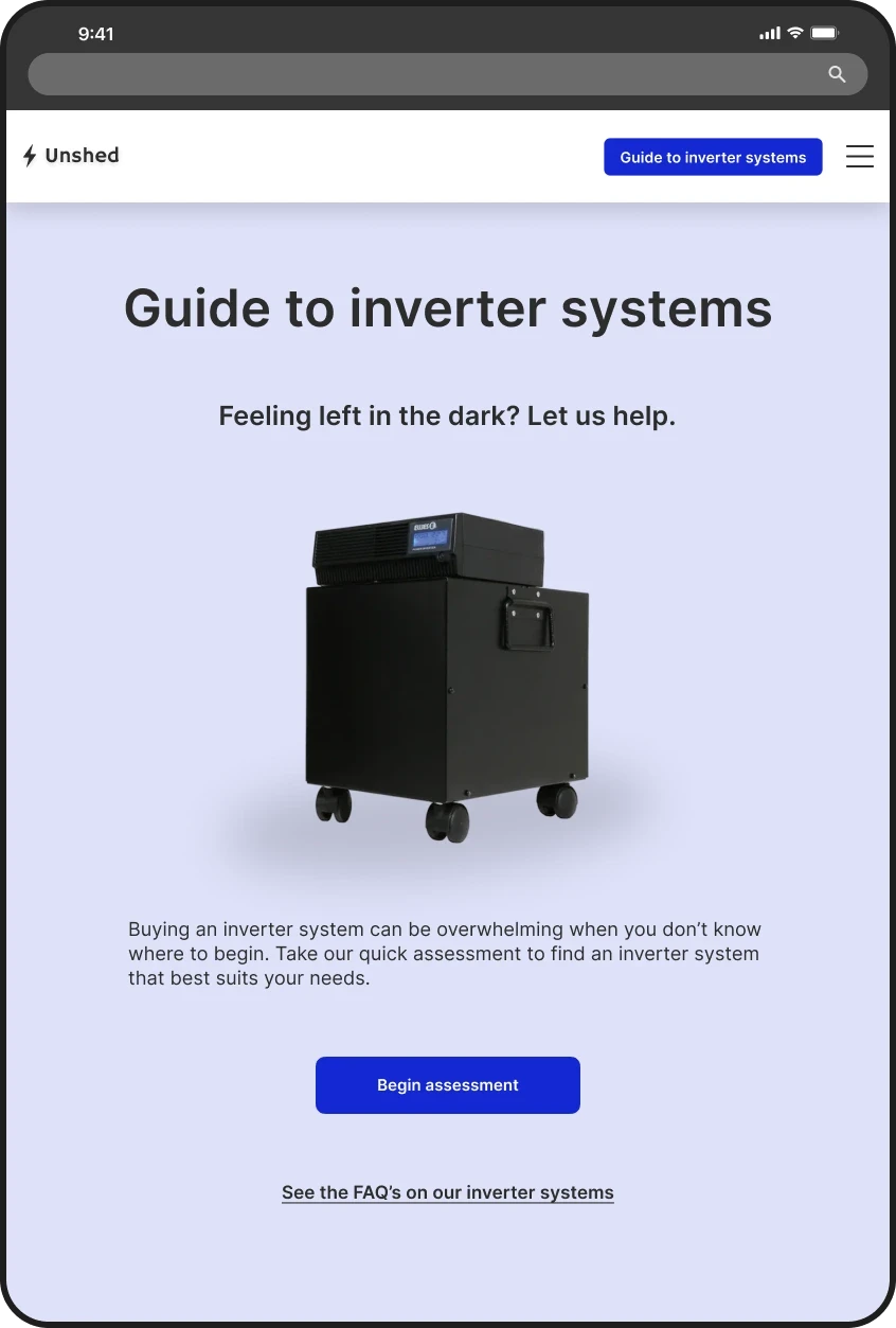
I designed a new website that guides users through the selection and purchase of backup power systems, which improve quality of life during power outages. The website also complements the Unshed app, providing extra support for those experiencing recurring power outages in South Africa.
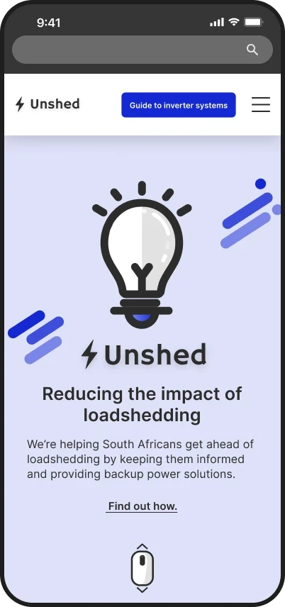
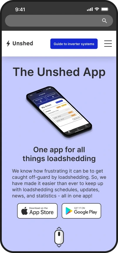
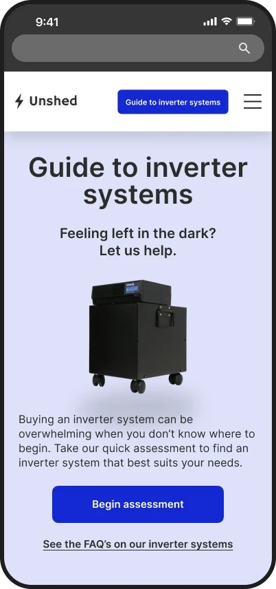
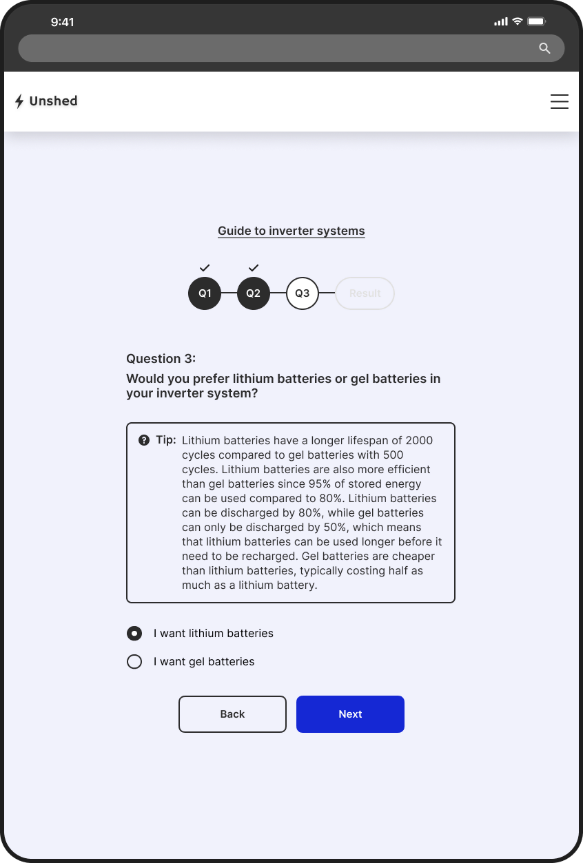
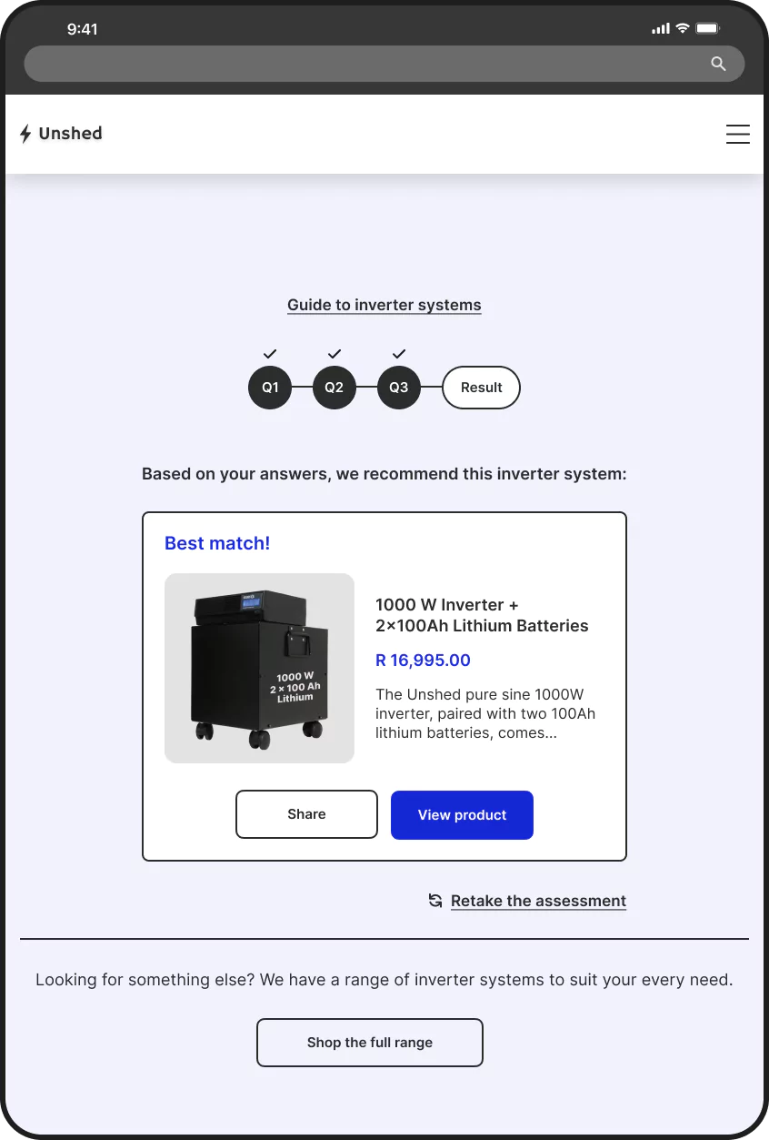
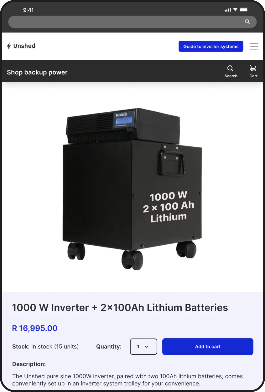
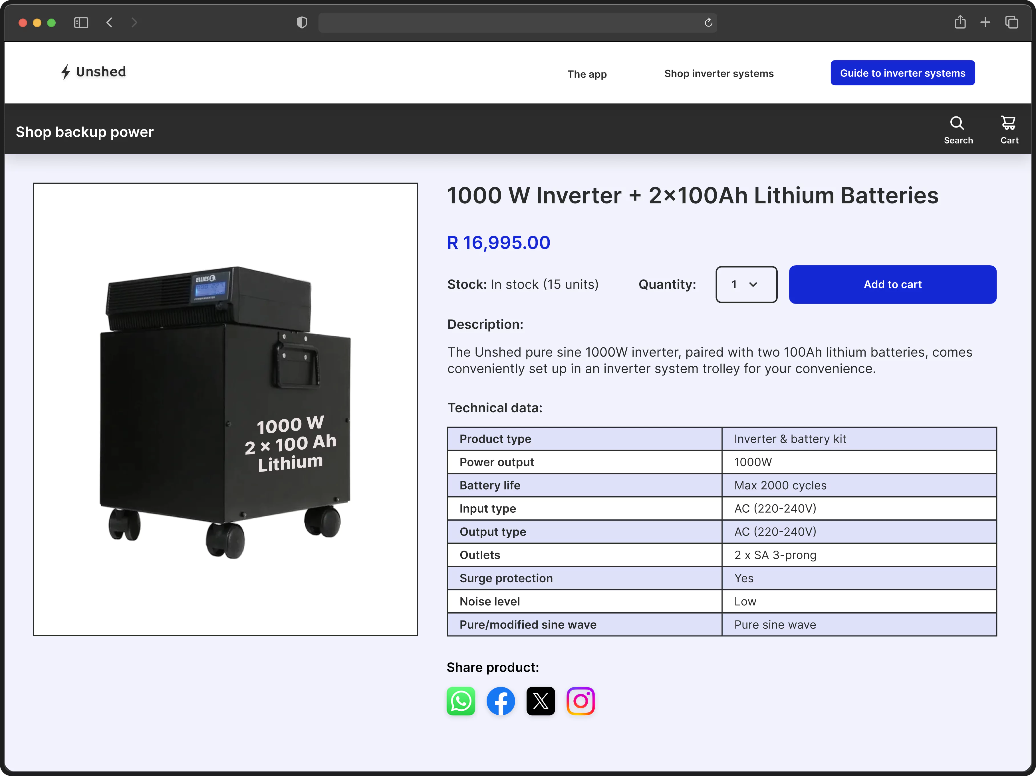
A selection of mockups of the website.
Process Overview

An iterative process, based on the Design Thinking framework.
I used insights from interviews conducted for the Unshed app to empathize with users in this project. These interviews highlighted that users, lacking backup power systems, often rush to complete tasks before power outages and have become accustomed to disruptions.
— Participant 1
— Participant 2
To define the problem, I developed a hypothesis based on the key findings from the research.
Hypothesis Statement
If users have access to a website that makes it easy to purchase inverter systems based on their individual needs, then users can purchase a practical solution to power outages.
I then conducted a Crazy 8s exercise to brainstorm solutions to the problem. The idea that seemed most promising was to create a backup power guide in the form of a quiz. The quiz results could suggest the most suitable inverter system based on the user's specific requirements.
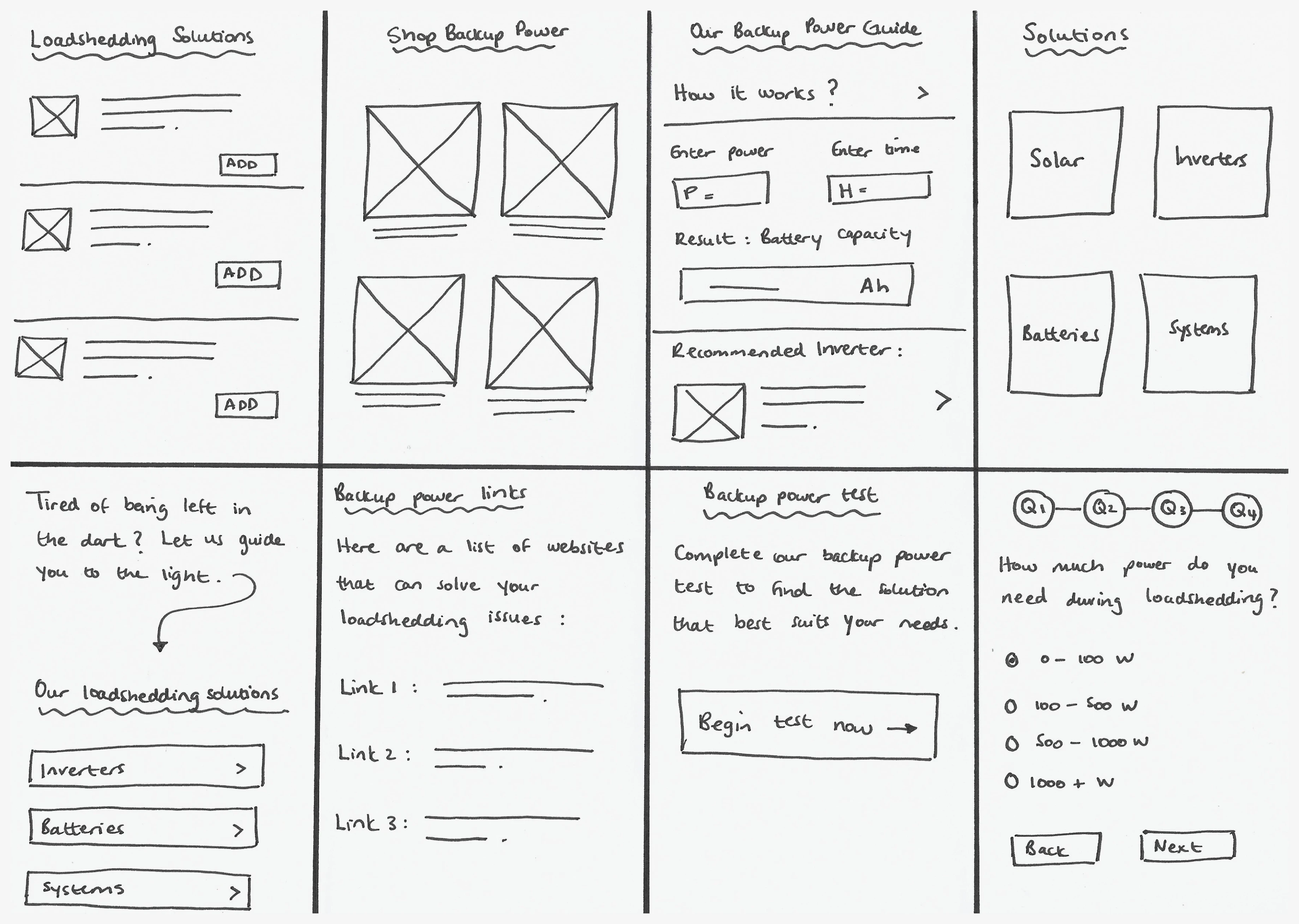
The outcome of the Crazy 8s exercise.
The next step was to create a sitemap and determine the user flow. To ensure that users successfully purchase an inverter system that meets their needs, they have to be directed to the quiz first and then to the recommended product page. Since the concept of the website was inspired by the Unshed App, I decided to dedicate a page on the website to promote the app.
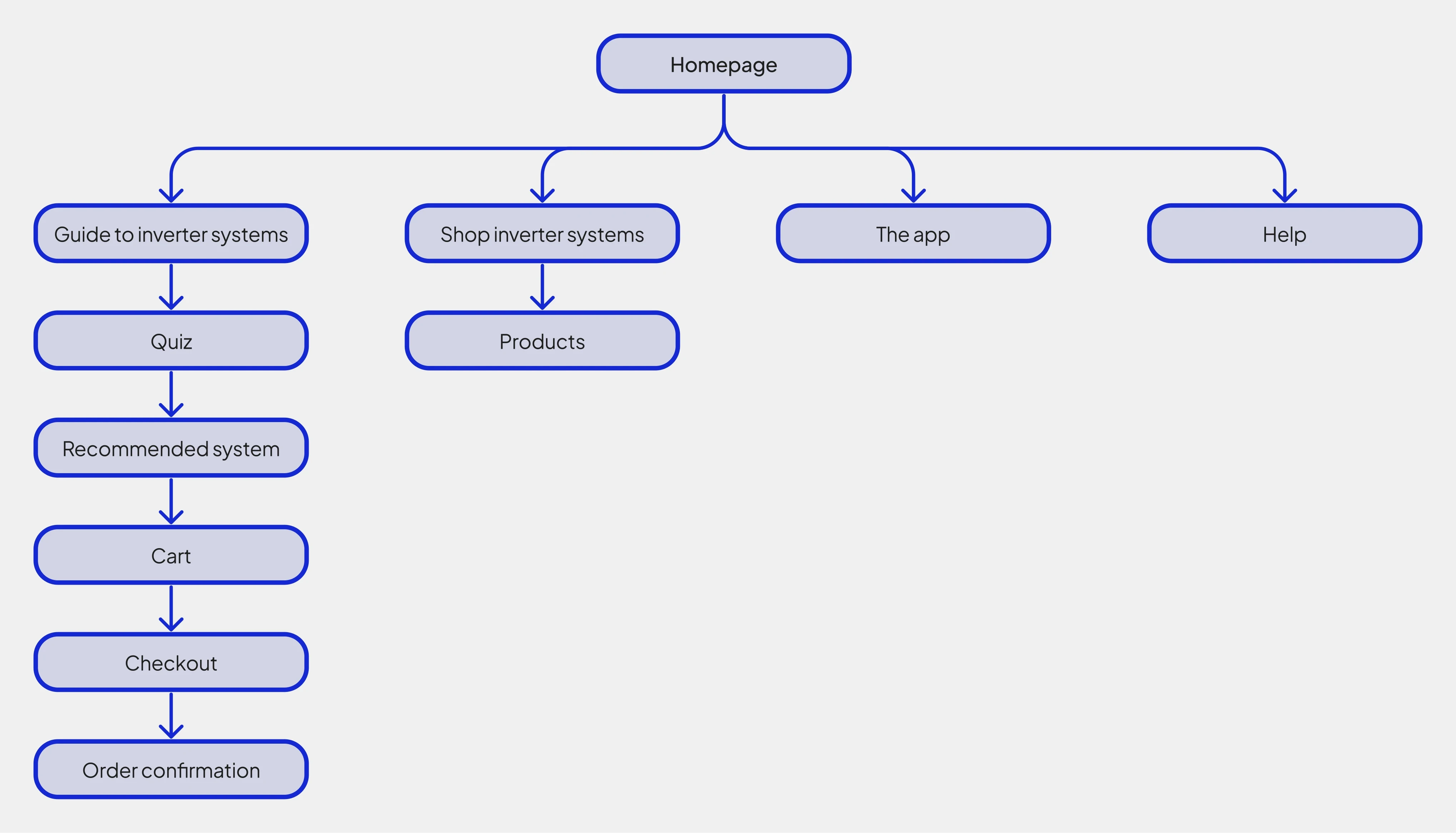
A sitemap showing the hierarchy of pages on the website.
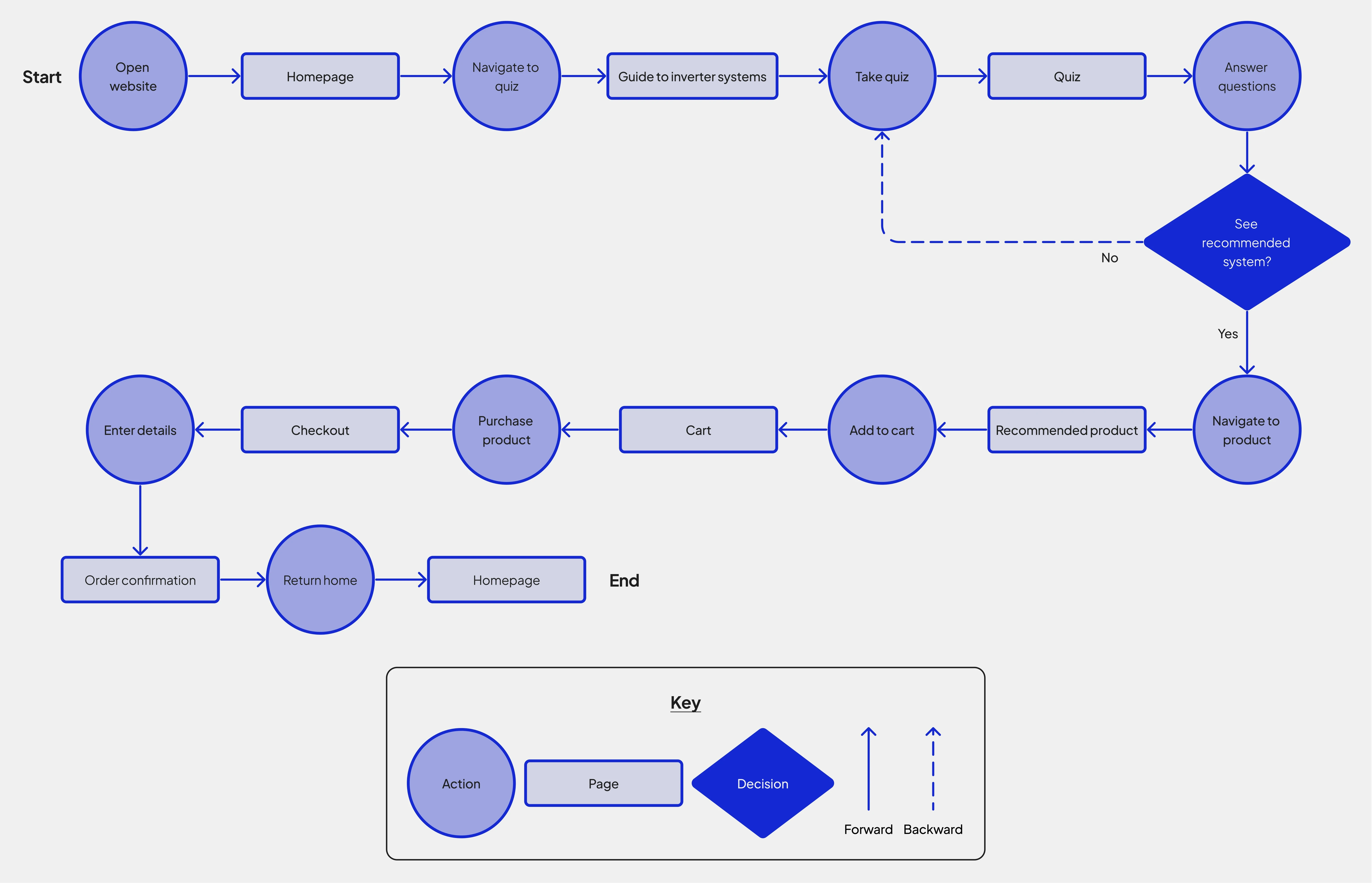
The website's user flow presented as a flow chart.
Because users experiencing a power outage are more likely to have internet access on mobile phones than on electricity-dependent devices like desktop computers, I first designed the website for mobile phones and later adapted it to fit larger screens like tablets and desktops. The sitemap and user flow guided the design of the wireframes, which were subsequently developed into a low-fidelity (lo-fi) prototype.
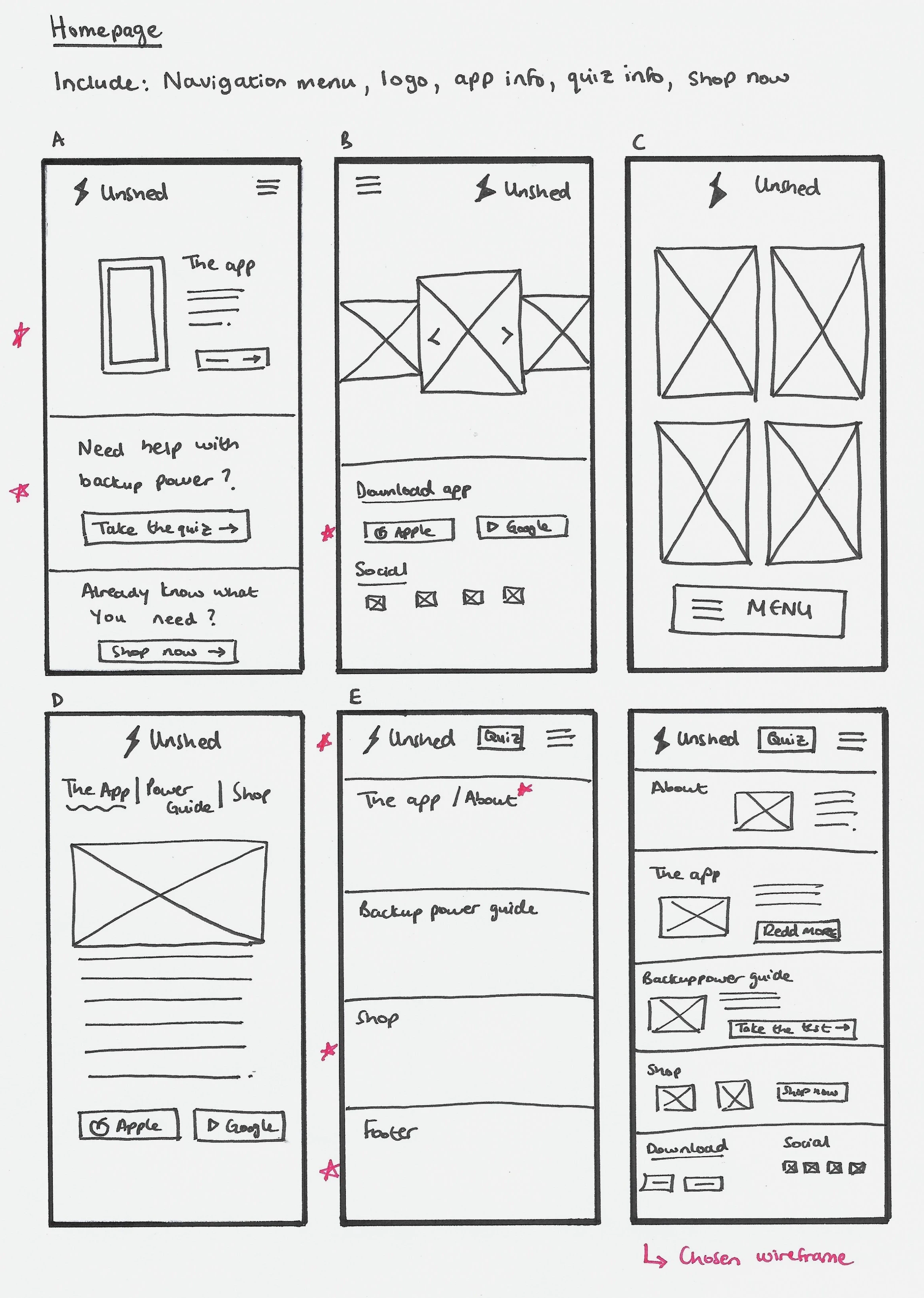
An example of the iterative process used to develop paper wireframes for each page of the website.
The lo-fi prototype was tested in a moderated usability study. The study revealed insights to enhance the website, and I incorporated some of these improvements into the design by updating the wireframes.
Insight 1: Give users a hint when they need to scroll down the page.
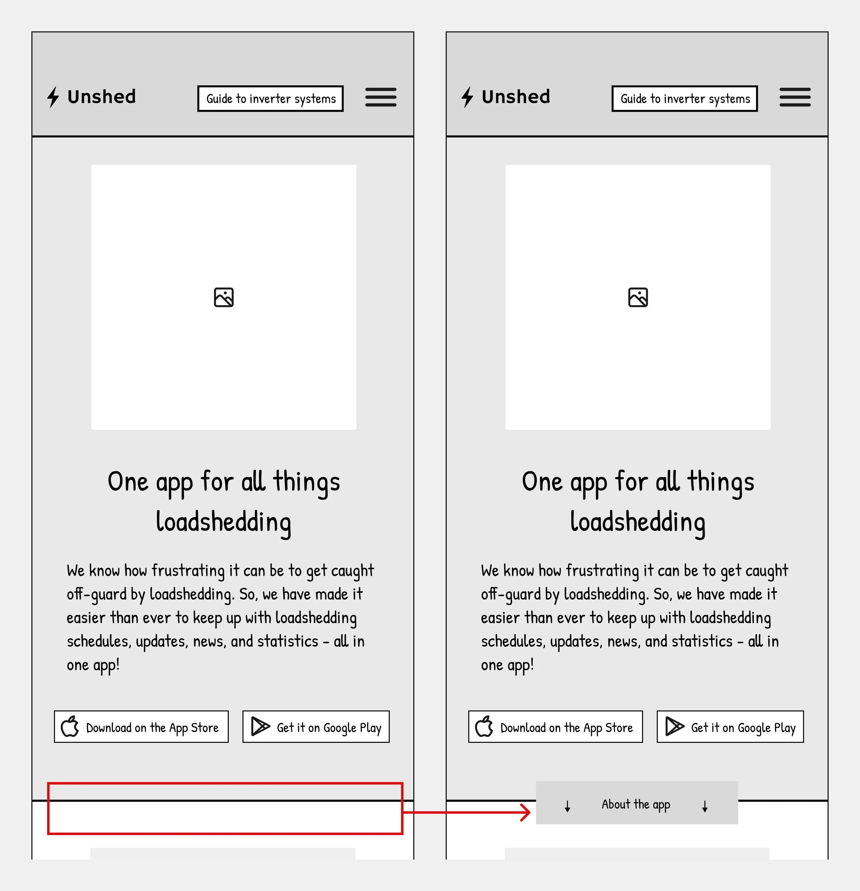
The before and after wireframes of Insight 1.
Insight 2: Make the tips on the quiz questions stand out more to make sure users read them.
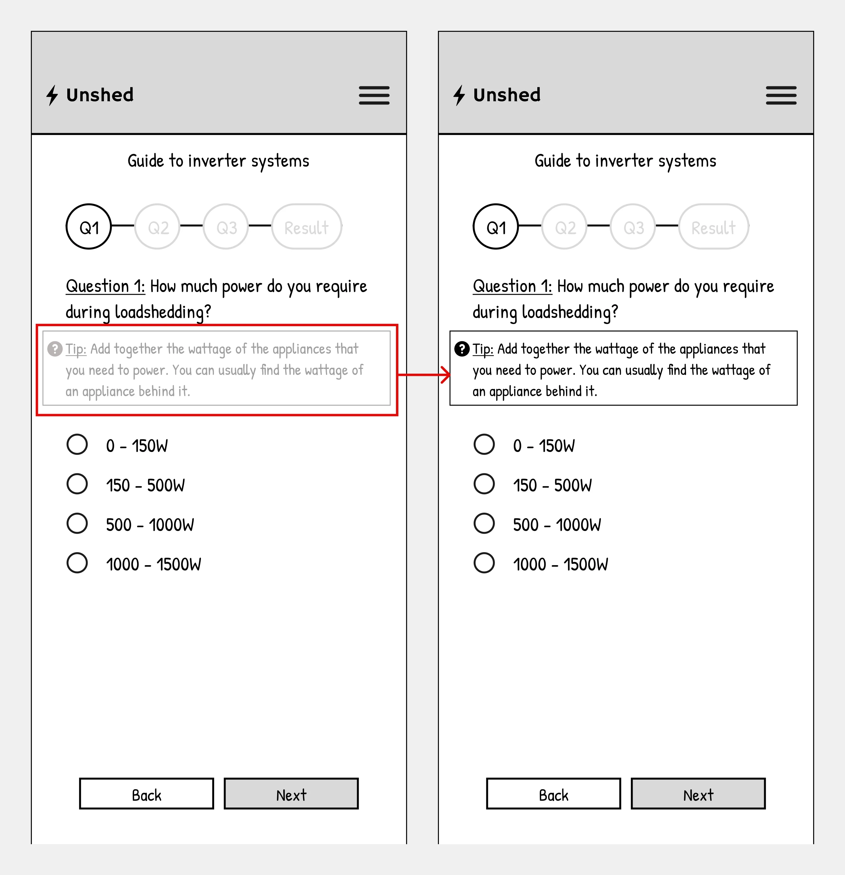
The before and after wireframes of Insight 2.
Usability Study Metrics
100% Conversion Rate
5/5 participants could select and purchase an inverter system based on individual needs.
The average time taken for users to complete the main user flow.
It was important to use a UI kit in the high-fidelity (hi-fi) design to ensure consistency across the website. I used a similar UI kit to the one used for the Unshed app, with adjustments made for a website experience.
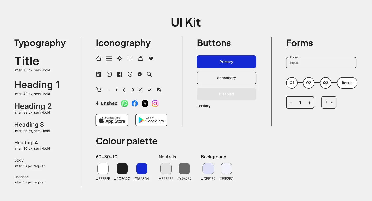
The UI Kit that was used to maintain consistency in the design.
Using the updated wireframes, I created mockups for the mobile website. I then made the design responsive by producing mockups for tablet and desktop displays. The mockups were then transformed into hi-fi prototypes.
Key Challenges
Figuring out the best battery for an inverter system, considering how much power is needed and for how long, was quite tricky. Doing these calculations was important to ensure that users would be recommended the right system for their needs after taking the quiz.
Another challenge was the time constraints on the project, which prevented a second round of testing. Despite these challenges, the project successfully met its goals by providing users with recommendations based on their power supply requirements.
Next Steps
A second round of testing could be done to make sure the website works well across devices. The first usability study only looked at the mobile phone version, so doing another study will determine how the website performs on other device sizes. Additionally, the user feedback from a second round of testing could be used to iterate the hi-fi design and optimise it.
Lessons Learned
Understand the user:
o
Empathizing with the target user ensures that the design is user-centric and meets their needs.
o
E.g. By taking a user-centric approach, I minimised my personal bias about what I believed the website should be.
Consider accessibility:
